Nuts.com is a DTC snack brand offering over 3,000 products through both one-time purchases and subscriptions. While most revenue comes from one-off orders, subscriptions generate millions in recurring revenue annually. Despite their smaller share of revenue, subscriptions were a major source of customer friction.
As the lead product designer, I owned the end-to-end redesign of the Nuts.com subscription management platform for 26K+ active subscribers.
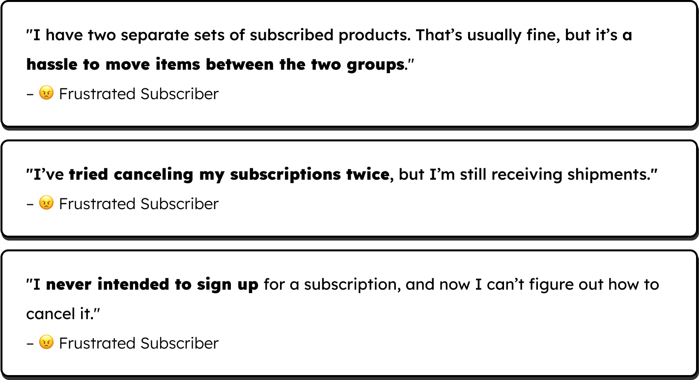
My research revealed what subscribers valued, where the experience broke down, and why they chose to cancel. The insights from four surveys and 14 interviews became the foundation for the redesign. Below are the three most critical pain points uncovered.
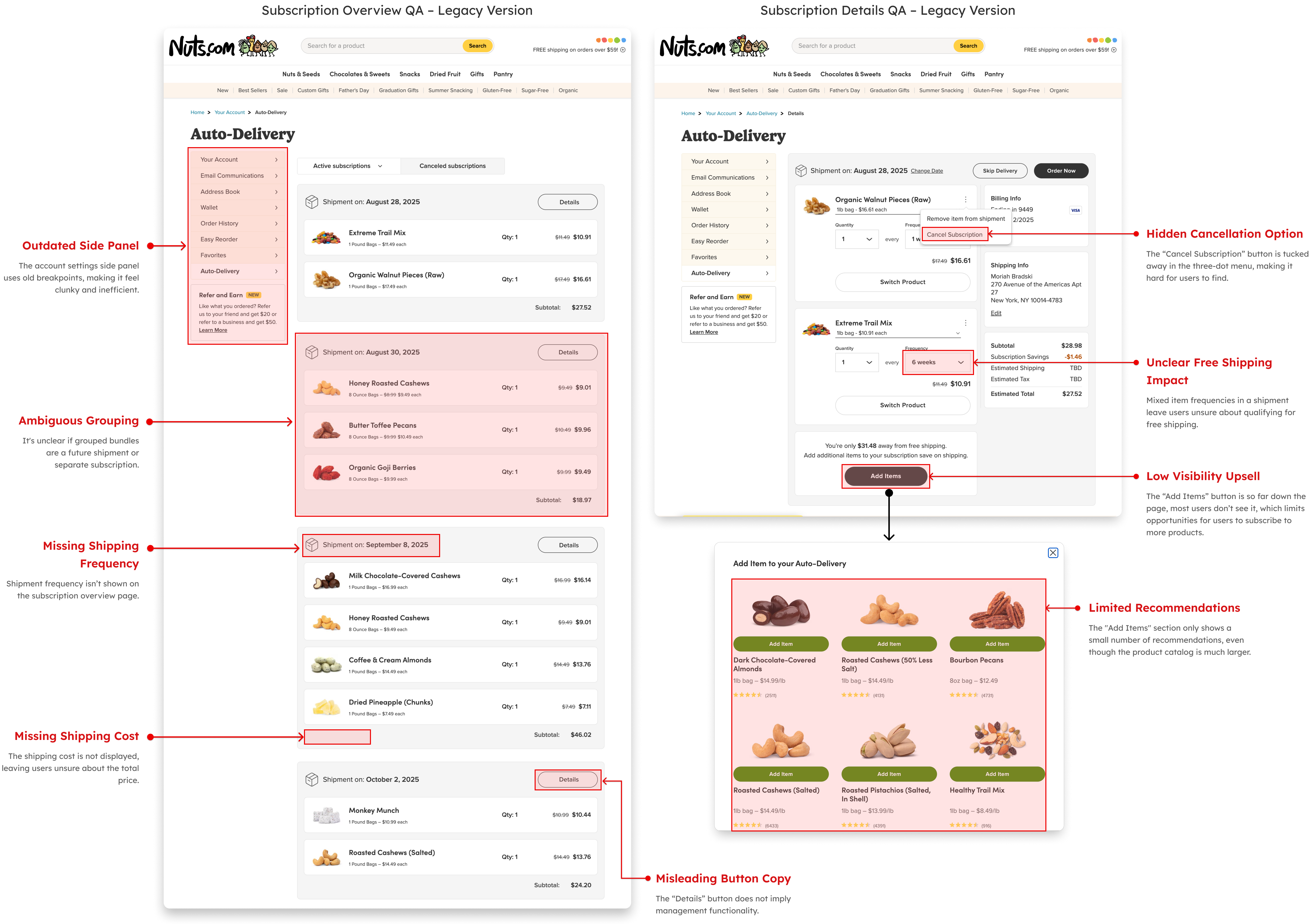
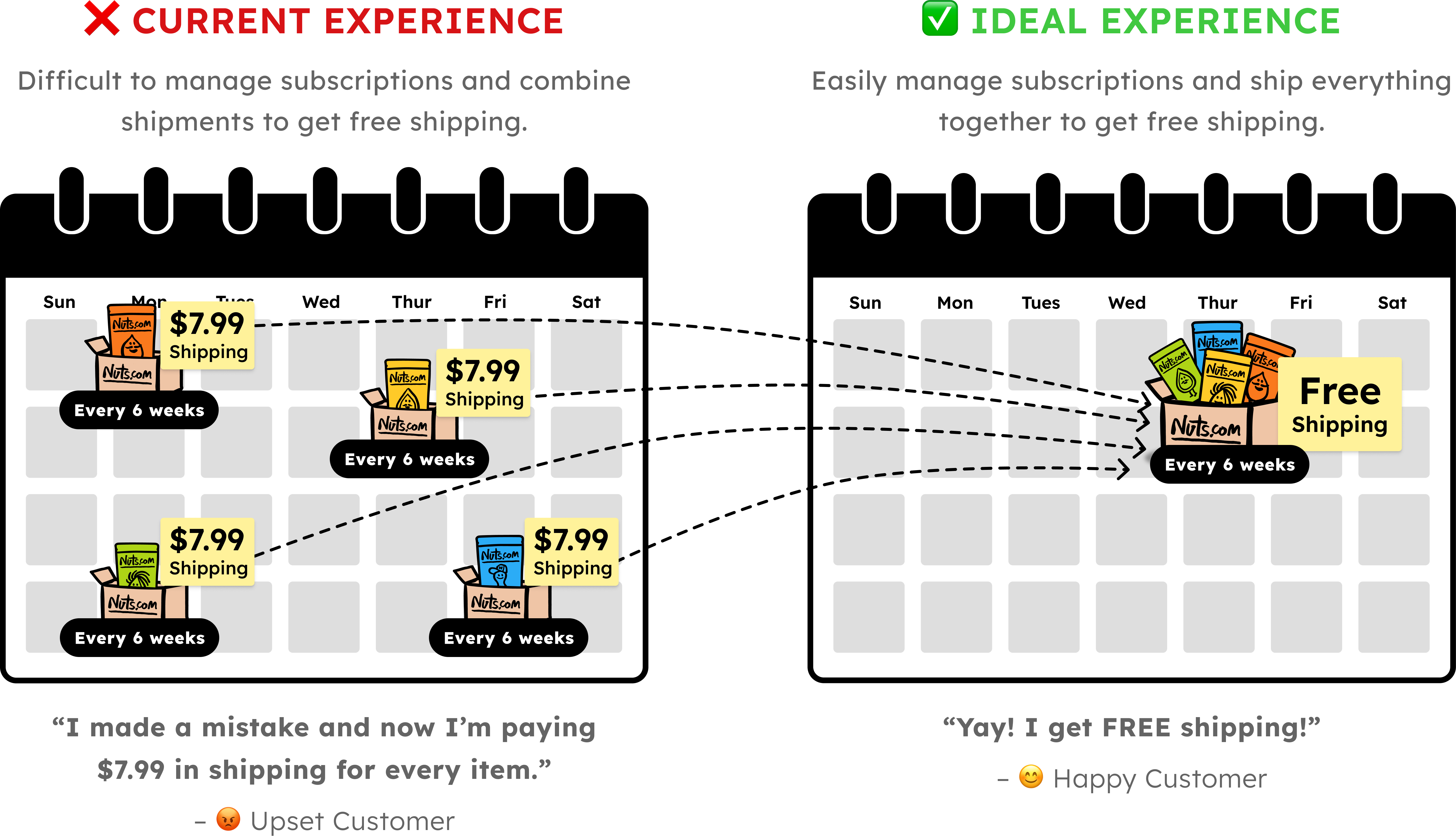
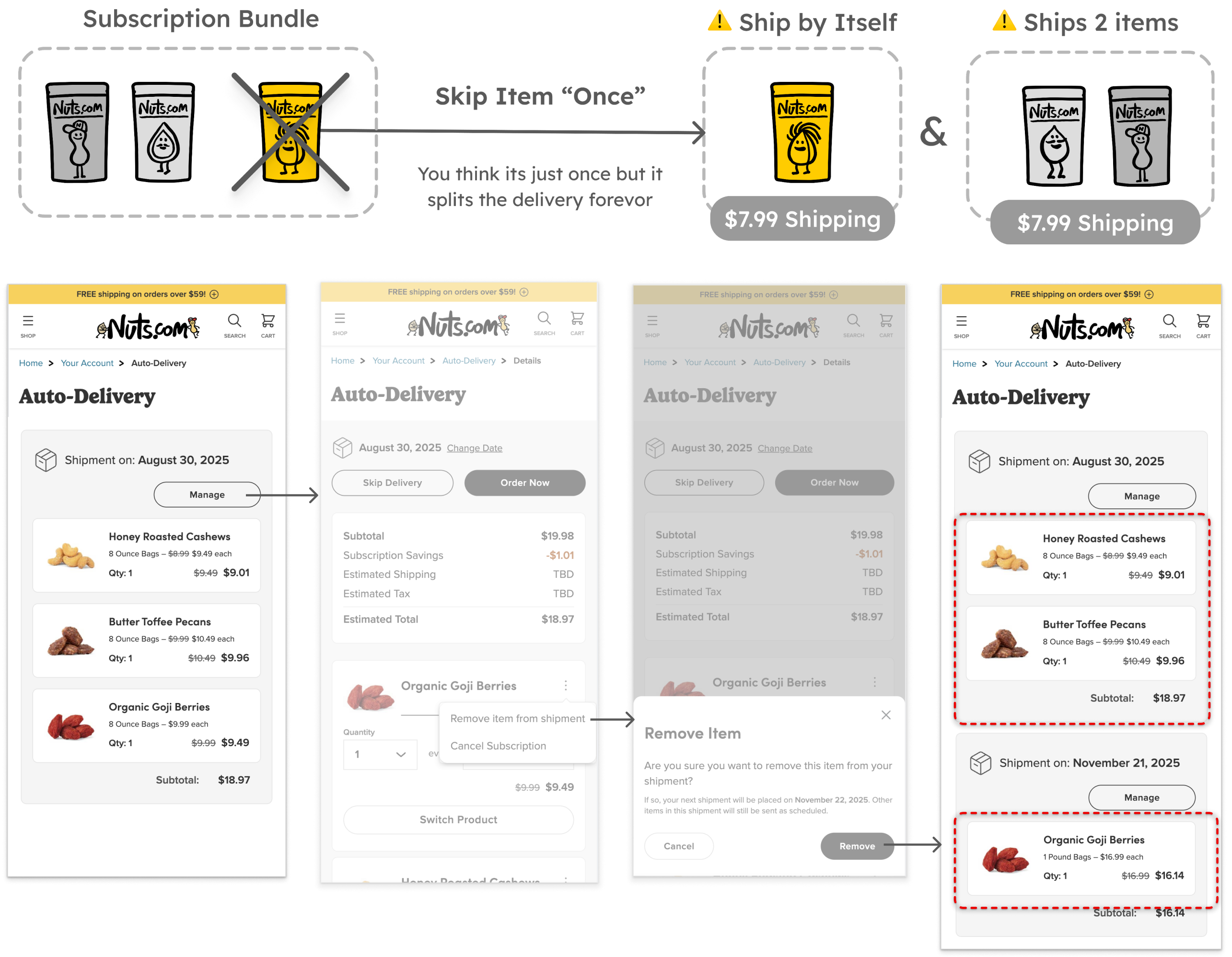
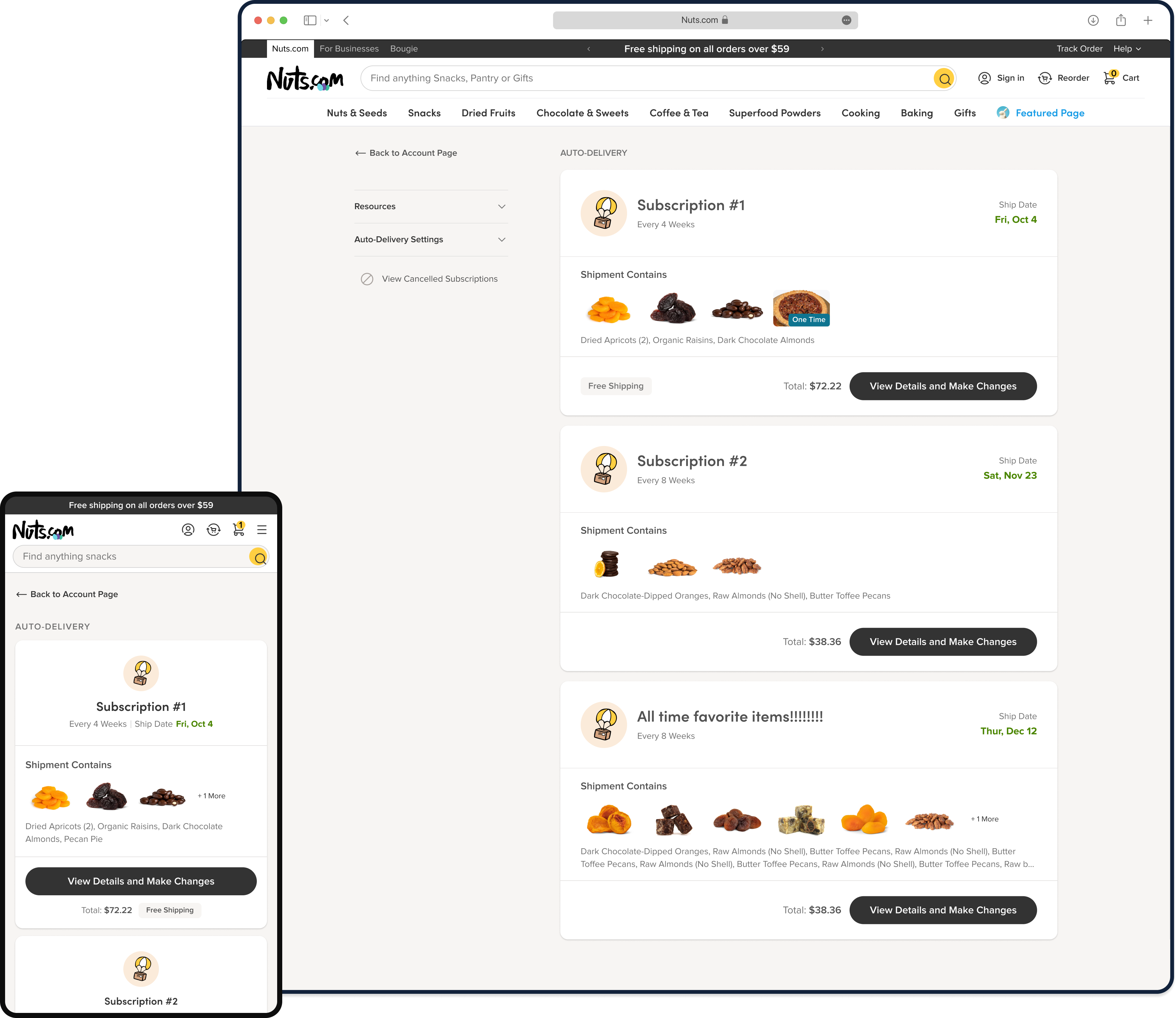
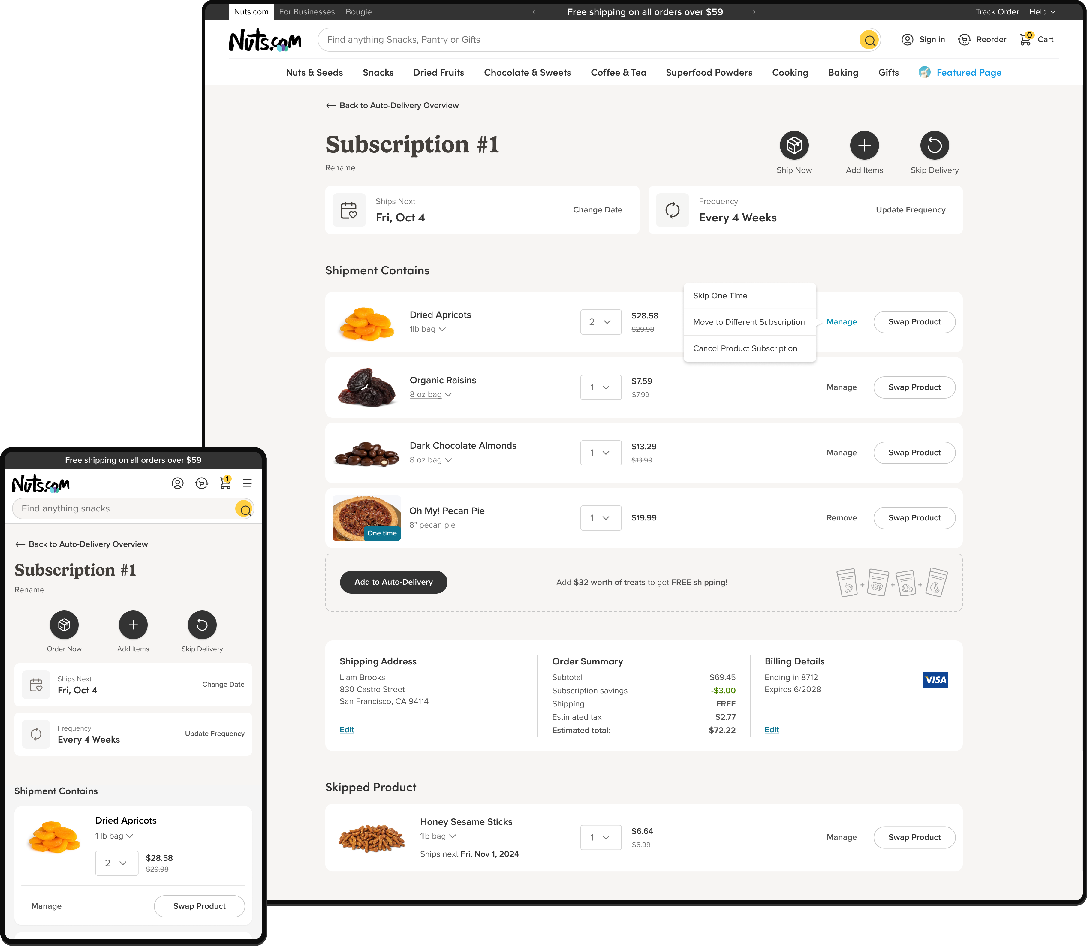
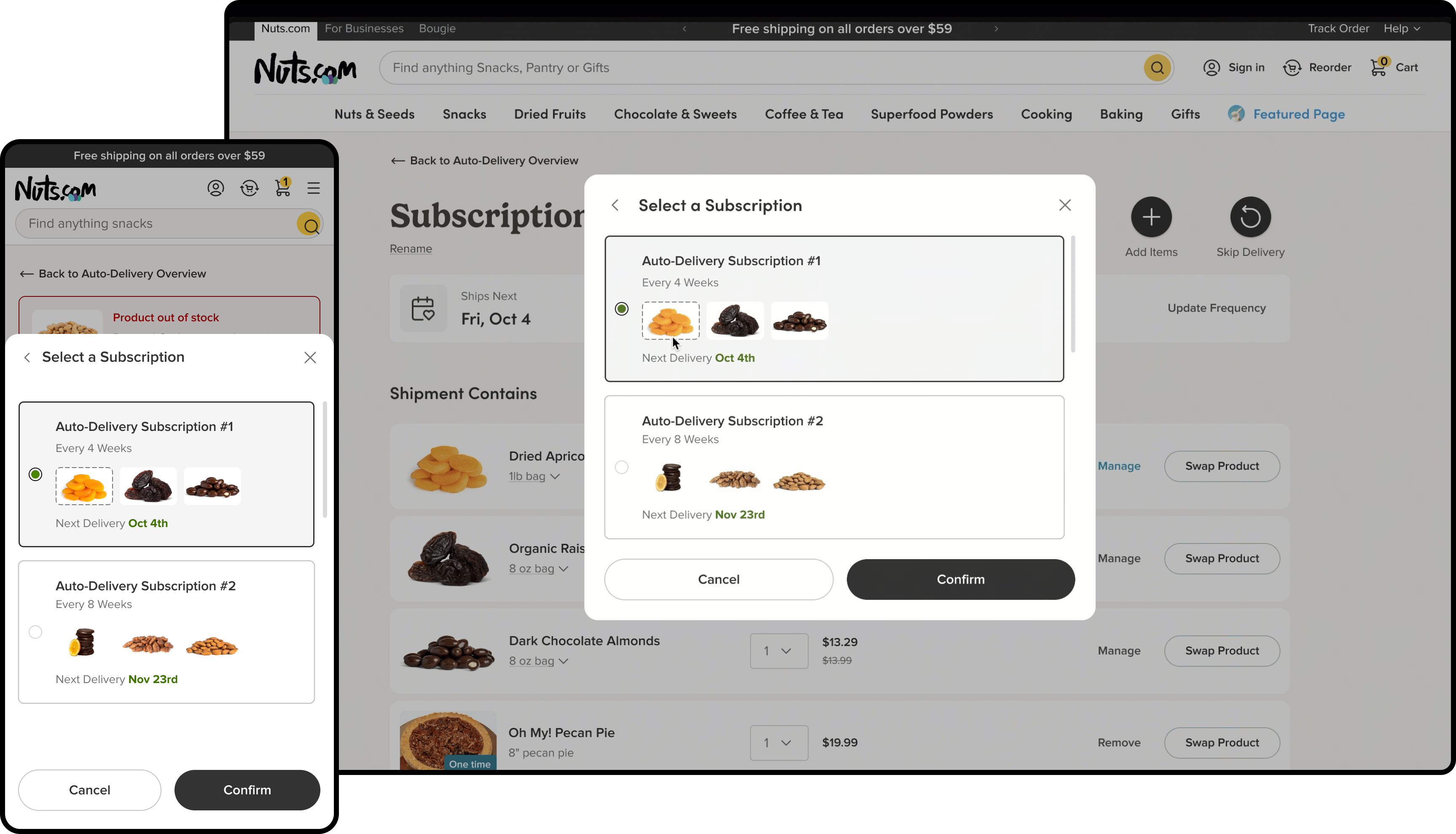
Customers expected subscription items to ship as a bundle to qualify for the $60 free-shipping threshold, but the system managed each product subscription separately, leading to accidental split shipments, surprise deliveries and unexpected fees.
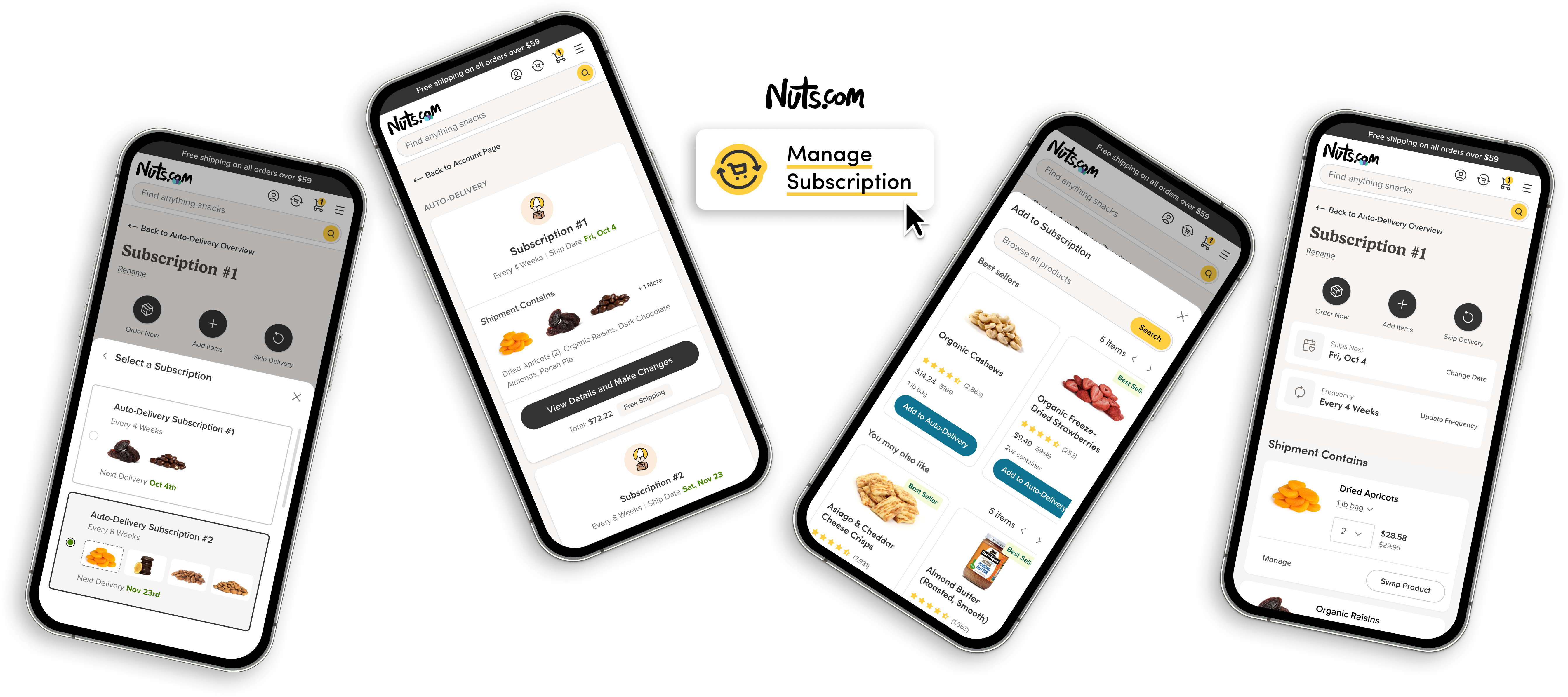
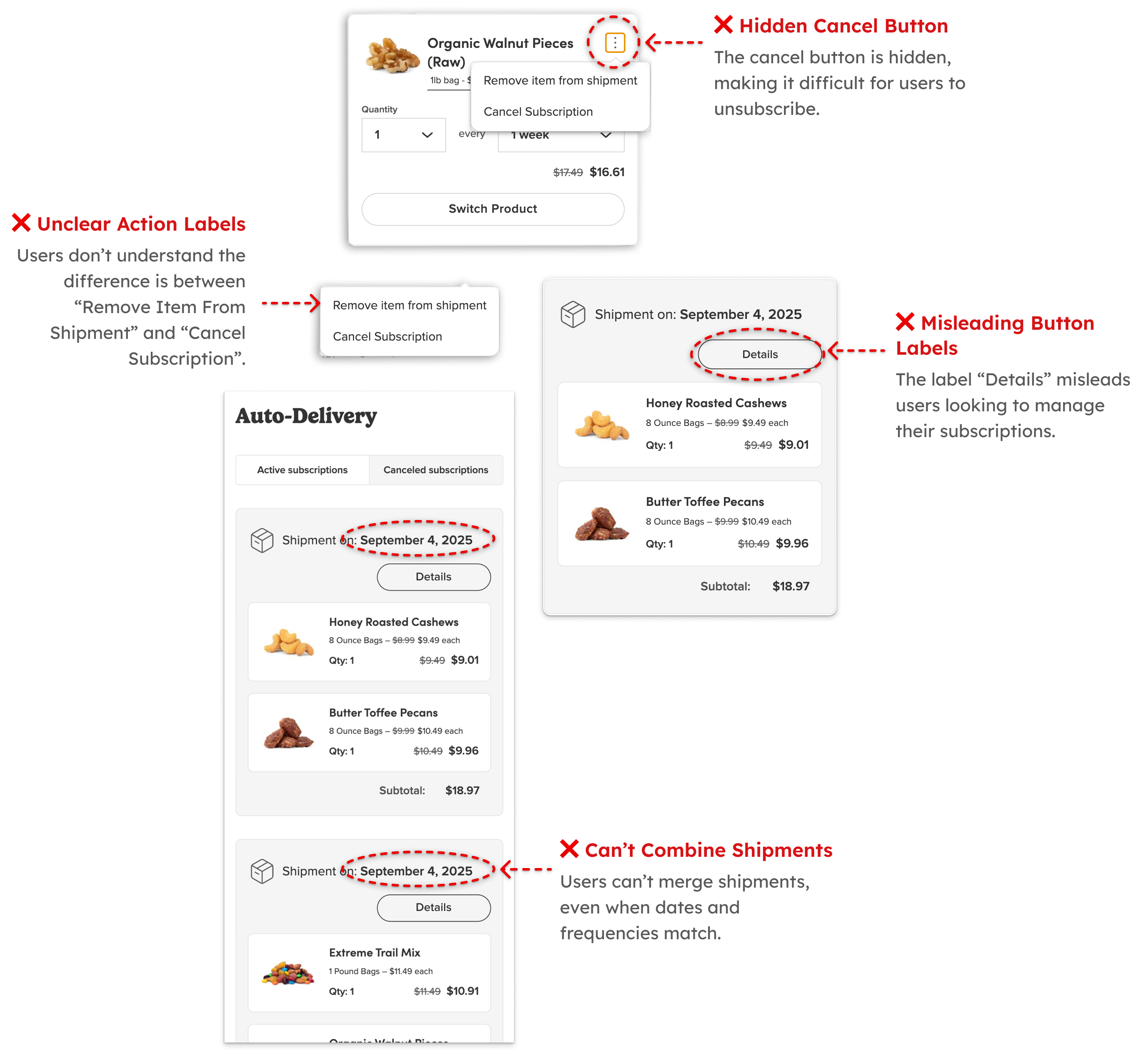
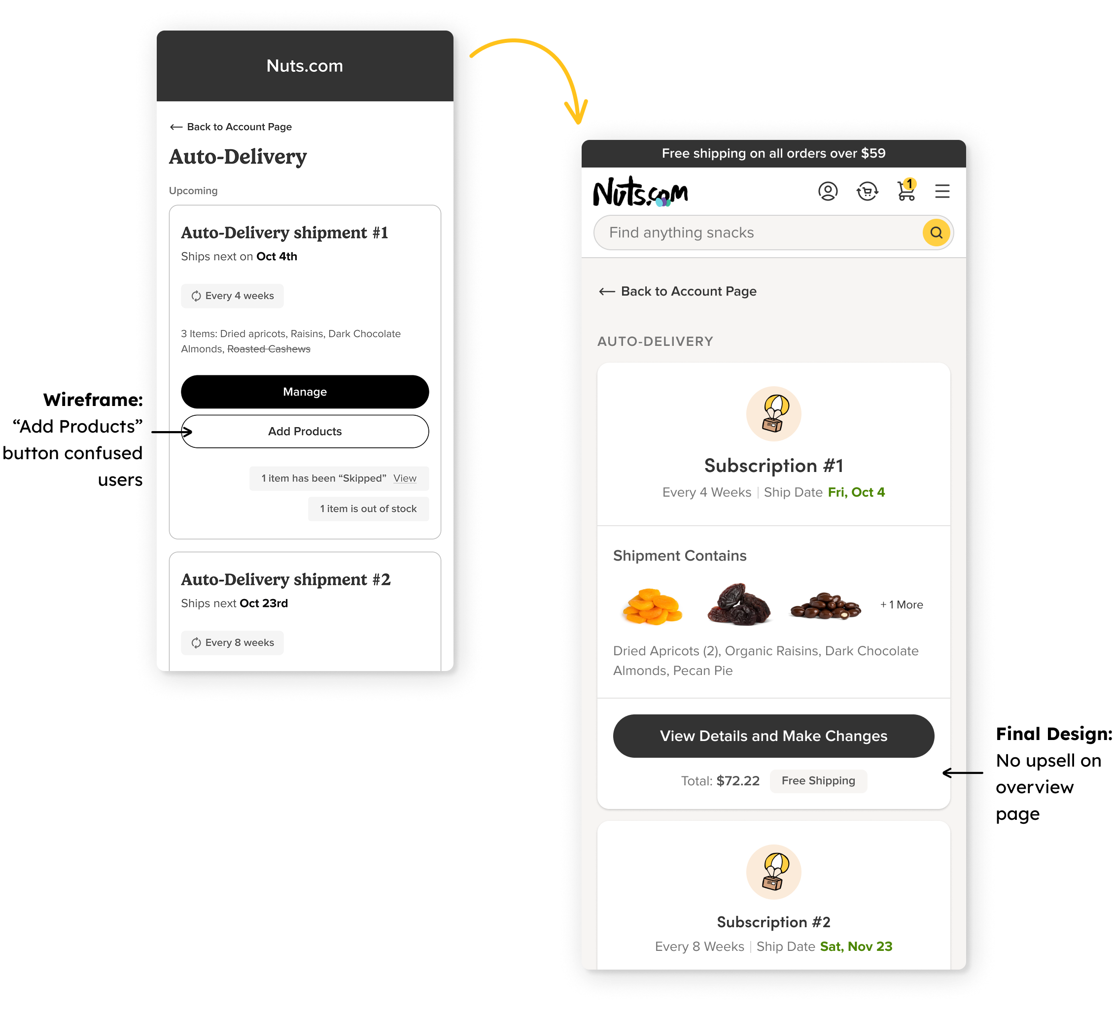
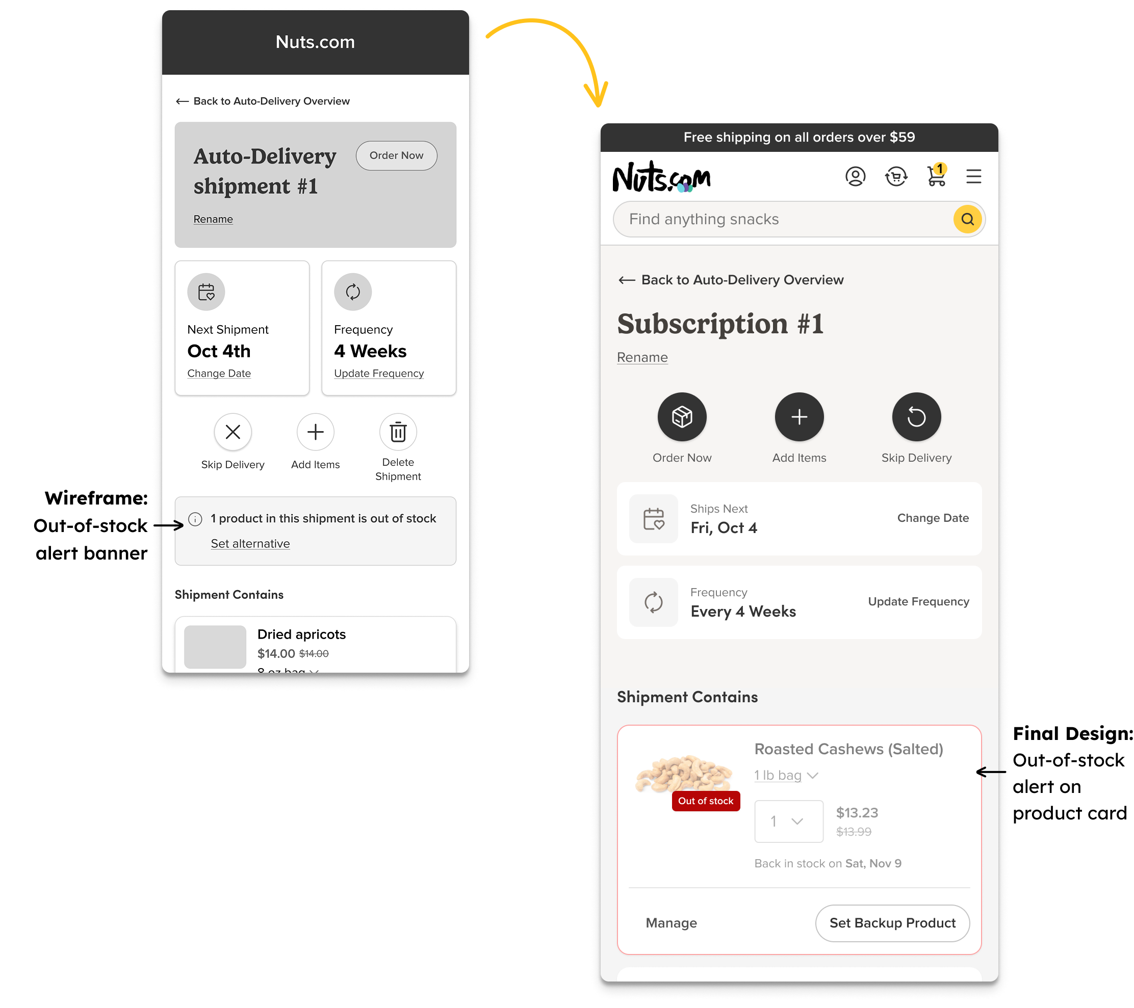
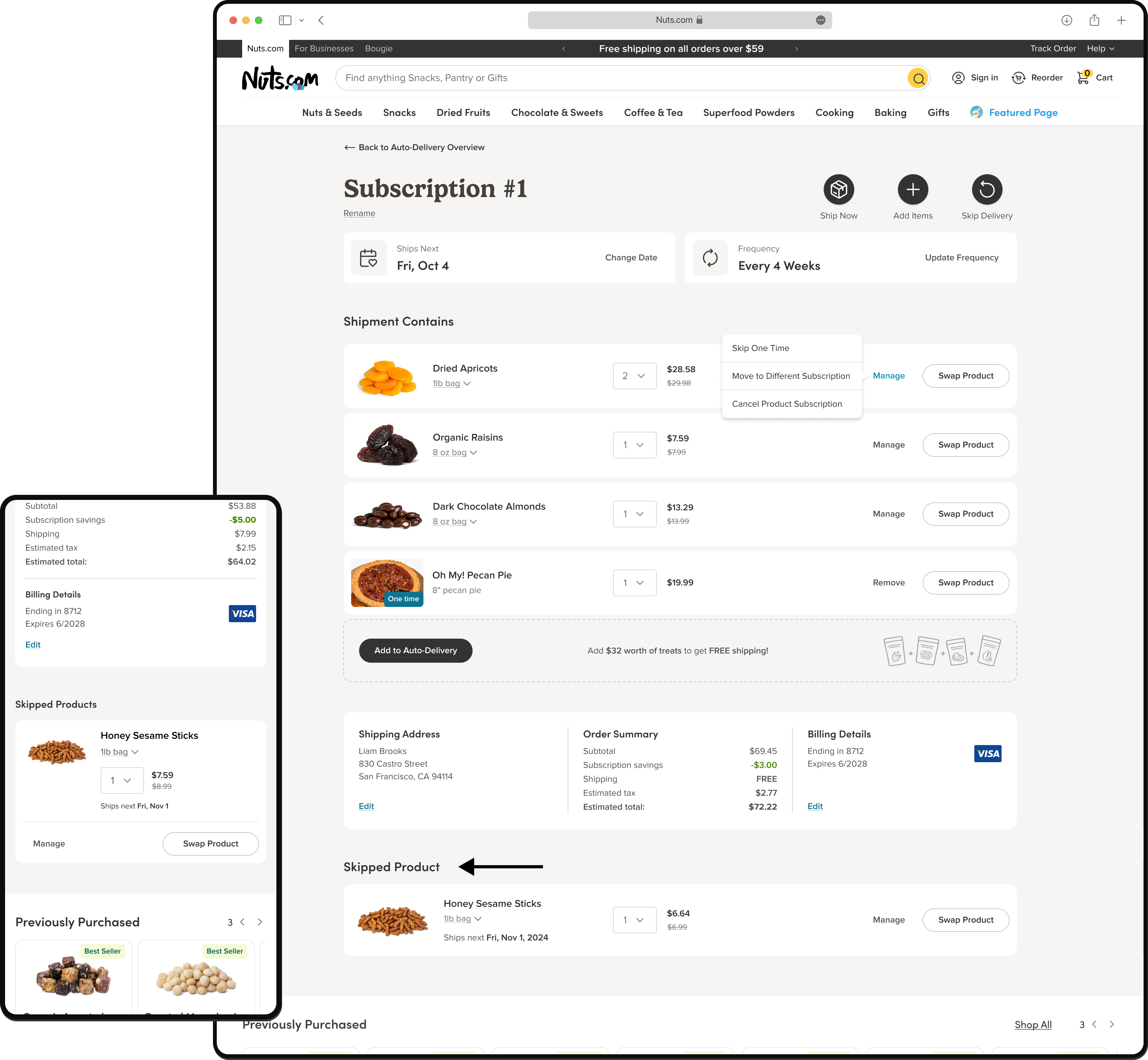
Many users found it hard to manage their subscriptions with confidence. Common actions, such as “Cancel Product Subscription”, were placed in secondary menus, making them hard to locate. There was also no way to merge or organize multiple shipments, which added friction for customers managing larger orders. Language throughout the interface contributed to confusion. Several users weren’t sure whether “Remove from Shipment” would cancel the product entirely. This lack of clarity led to accidental changes and increased support requests.
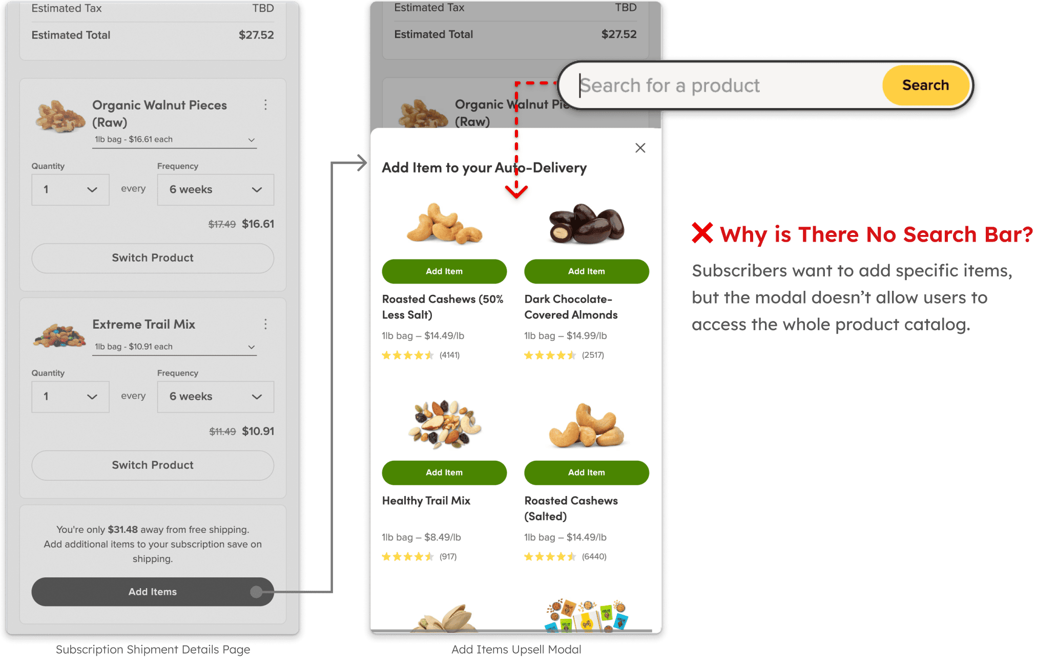
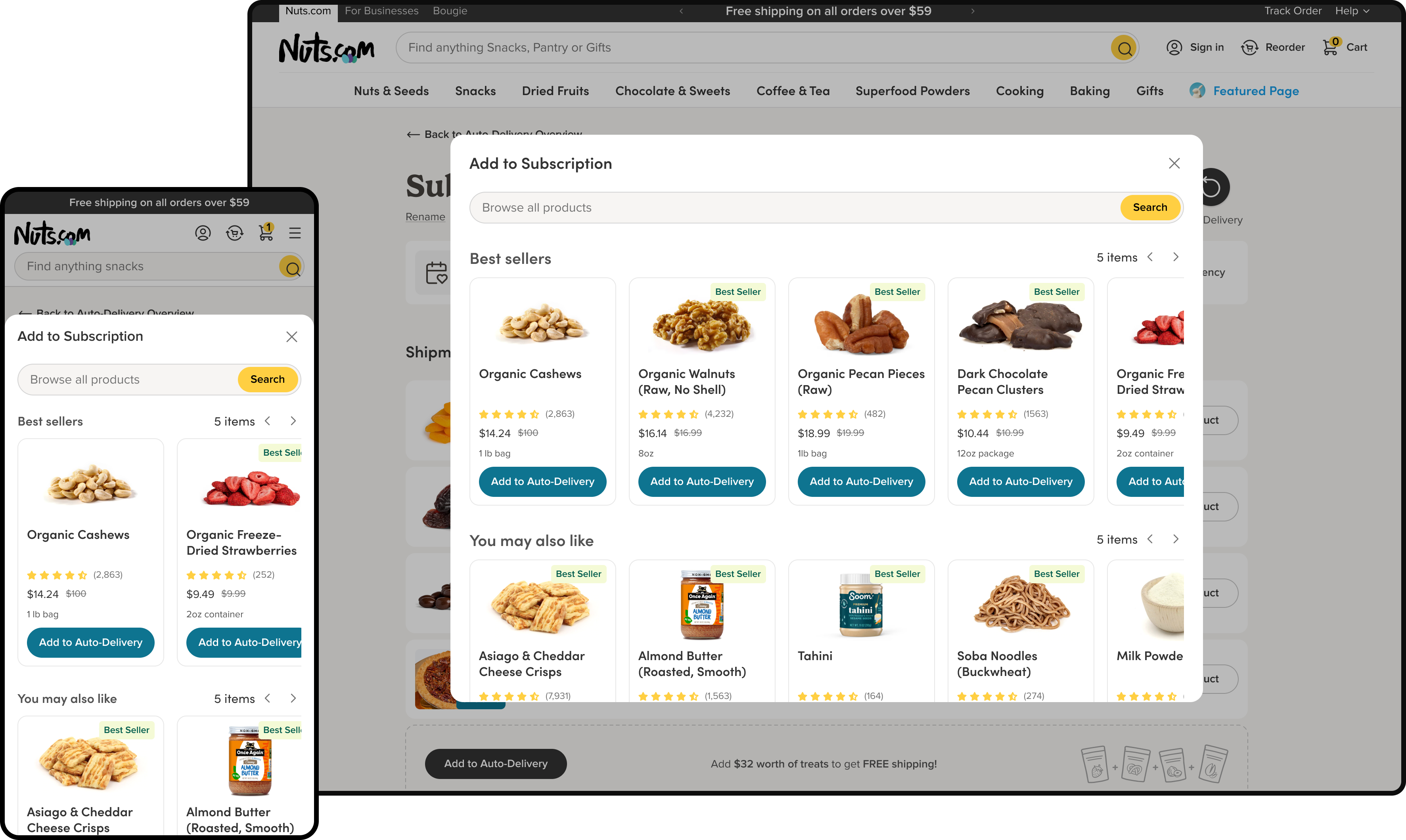
The “Add Items” modal accounted for 16% of new product subscriptions, but most users didn’t notice it. For those who did, the experience was limited, they couldn’t search the full product catalog because no search functionality was available. This made it harder for users to build their basket or discover additional items.
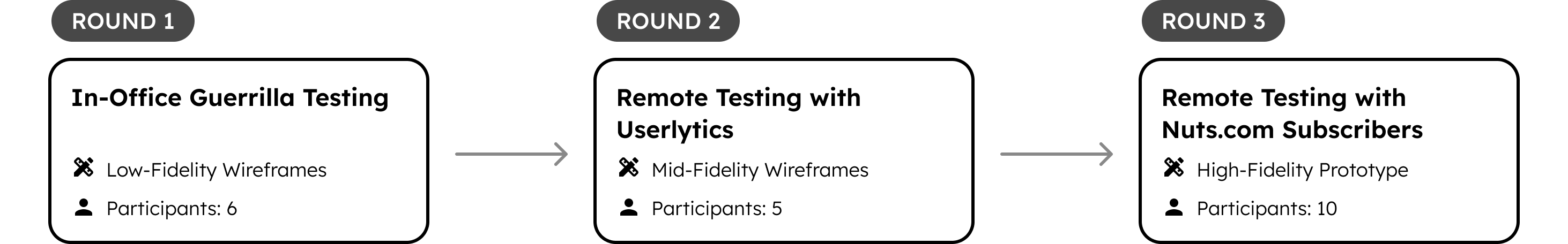
Launched on June 20, 2025, the redesigned subscription portal showed a 5% increase in average order value among active subscribers. While not A/B tested, the direction was shaped by qualitative research and validated through multiple rounds of usability testing.
Reach:
• 26.4K subscribers
• $200K in weekly recurring revenue
• $10M+ ARR
Design for high-retention users first.
Focusing on the needs of our most loyal subscribers, those who order frequently and retain over time, ensured the redesign aligned with the workflows and expectations that drive the most business value.
When you can’t A/B test, test what matters most.
In the absence of experimentation, we prioritized usability testing for high-risk flows. Validating directly with real subscribers gave us the confidence to move forward without guesswork.
Not every feature needs to ship at once.
We made intentional trade-offs—delaying advanced upsell logic and simplifying out-of-stock backup options, to focus on stability and clarity for launch. This helped avoid friction for existing users.
Cross-functional alignment starts with shared insight.
Collaborating closely with marketing and support grounded our rollout strategy in what subscribers actually valued, based on firsthand research, not assumptions.