RTA Cabinet Store sells flat-pack kitchen cabinets at prices lower than IKEA or Home Depot. It is the top-performing brand in a portfolio of nine e-commerce sites owned by Renovation Brands, where I worked as an in-house product designer.
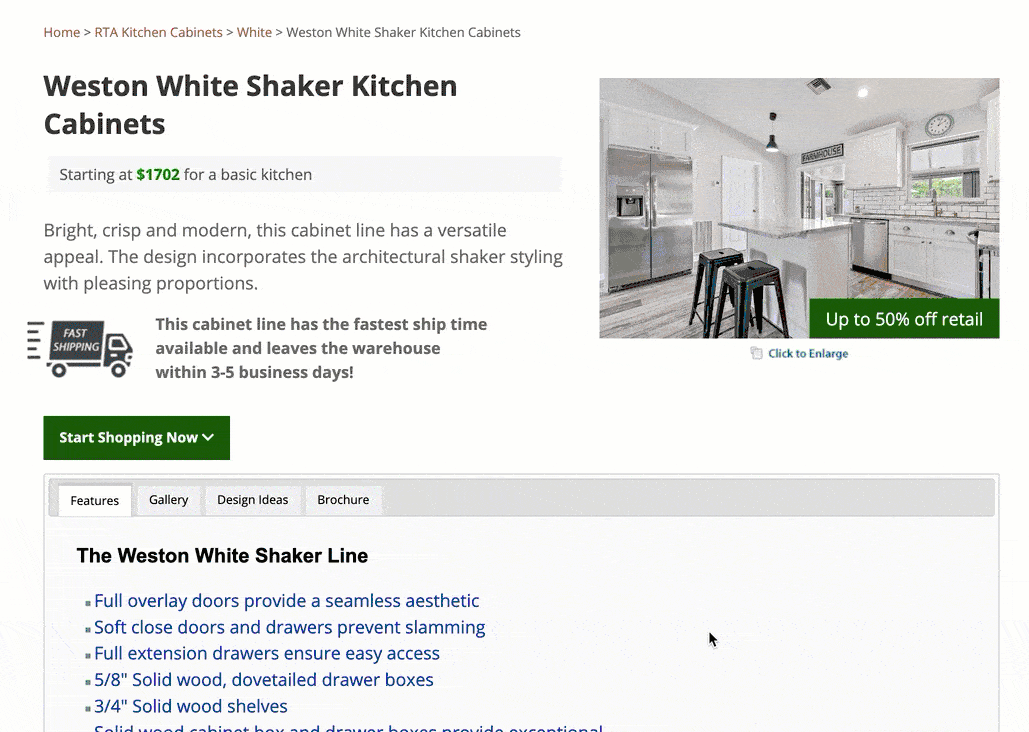
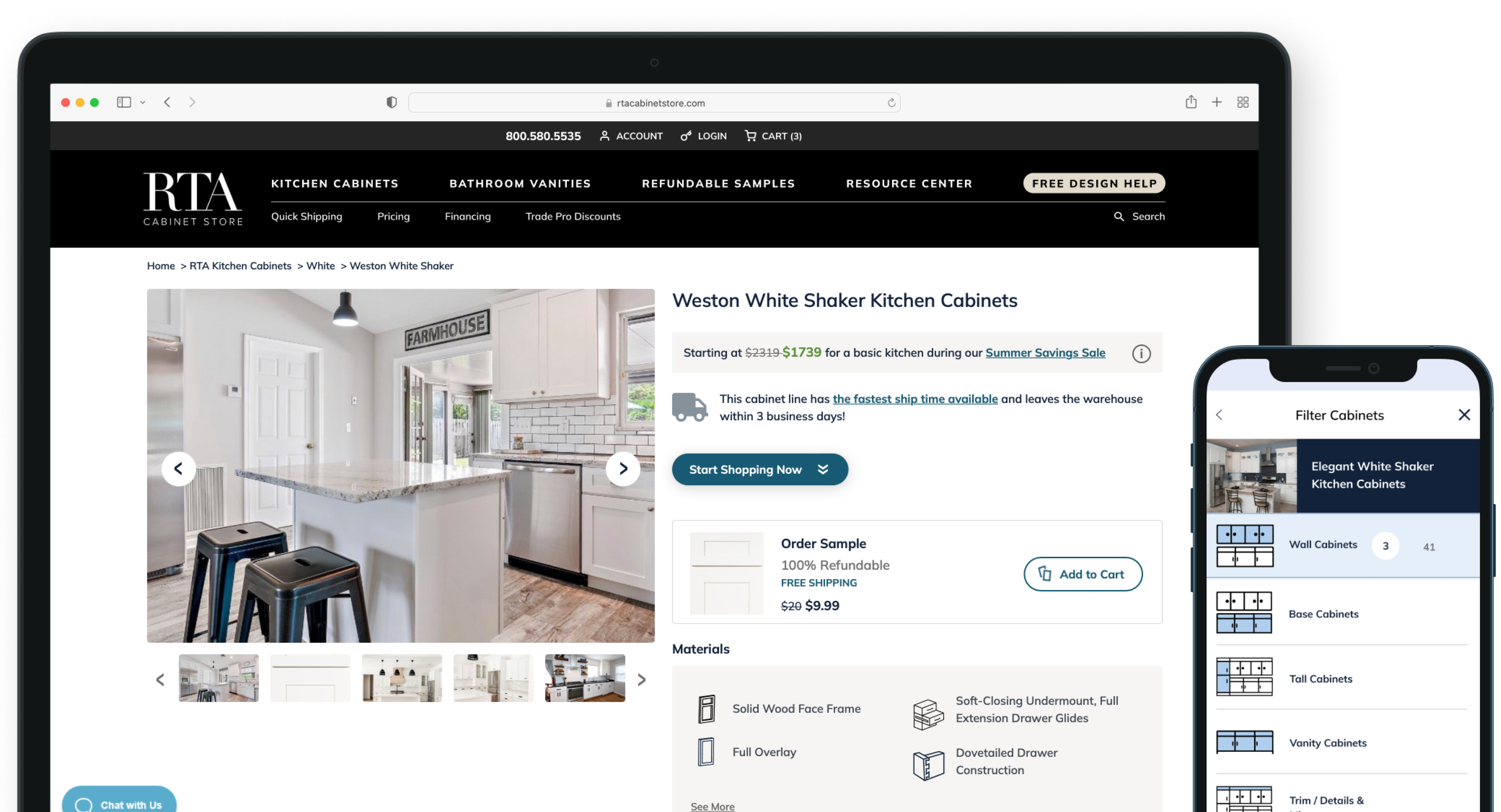
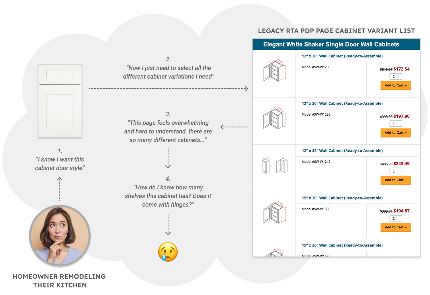
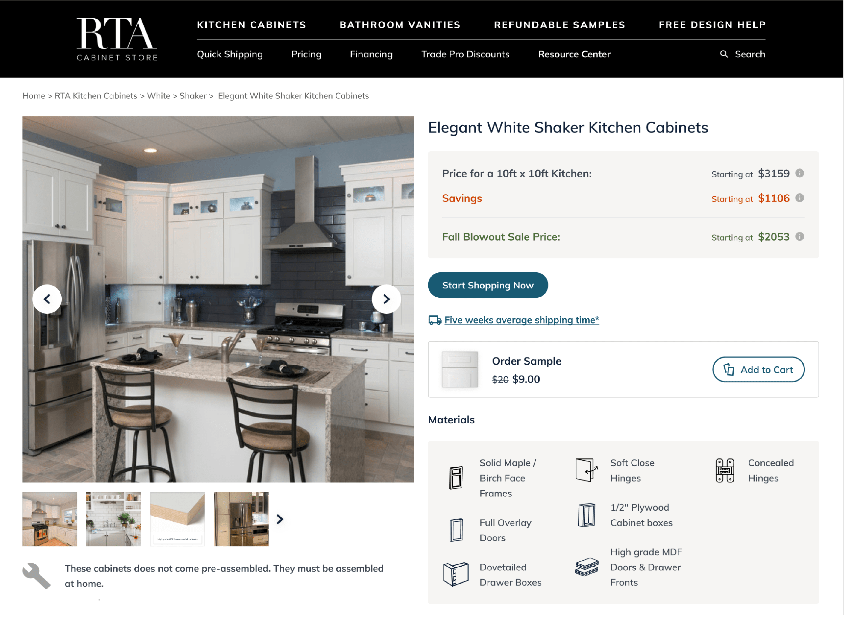
The product detail page for each cabinet style listed 200 plus configuration options without search or filters. Visuals and important product information like cabinet materials, dimensions, and hardware were inconsistent or hidden. Homeowners struggled to navigate and understand the information on the page and frequently called to ask for information.
I made the case for this redesign as the highest-impact opportunity across our 9-site e-commerce portfolio at Renovation Brands. While there were competing initiatives from other brands, RTA was the biggest site by revenue and profit, and its product detail page was the most important part of the shopping experience. I won stakeholder support for prioritizing a re-design on the roadmap by presenting my findings and my proposal for the project scope and KPIs.

Buying new cabinets for a kitchen remodel is a very high scrutiny purchase for a customer. The price tag can range from $8,000 – $100,000 if you factor in cost of materials and installation. The web experience for cabinet selection needs to help customers avoid costly mistakes.
My goal was to make it easy for customers to:
1: Evaluate cabinet style, quality, and durability.
2: Ensure cabinets fit their desired layout.
3: Assemble a complete, correct cabinet order.

I balanced two important business objectives during the re-design.
Customers ordering cabinets for a typical 10×10 kitchen typically select around 10 cabinets. The new experience needed to make this selection process clear and intuitive in order to maximize conversion rate on site.
Key Metric(s): Overall Conversion Rate (CVR), Average Order Value (AOV)
The new design needed to encourage new visitors to order samples and request kitchen design help, since both actions significantly increase the likelihood they'll commit to a full kitchen purchase.
Key Metric(s): Sample Conversion Rate (Sample CVR), Kitchen Design Consultation Sign-Up Rate
Only one developer could support the project, so I focused on solutions we could implement quickly. I collaborated with him at each step to confirm feasibility and adjust scope as needed.
The site carried many cabinet lines from different vendors and the catalog changed often. Most lines were not compatible with each other and provided specifications varied by vendor. I designed around this reality by standardizing a core set of information fields, and choosing patterns that worked even when data was missing. This constrained some solutions and guided the final architecture.
Getting buy in for and sign off on this project required aligning a lot of different stakeholders who often had competing priorities and risk tolerances.
I conducted research to better understand our customers and their goals and frustrations when it came to finding and selecting the right cabinets.
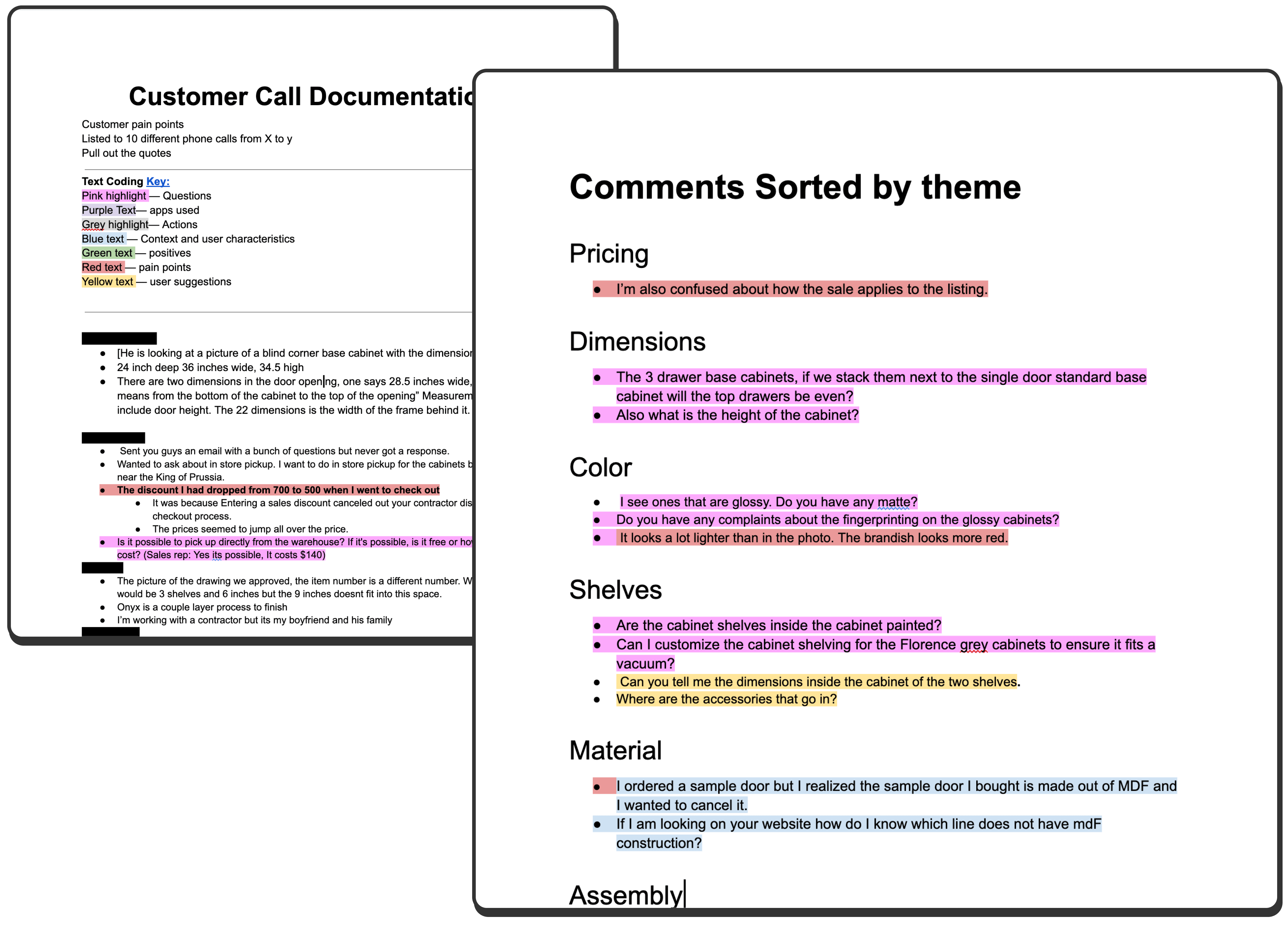
I interviewed six RTA kitchen designers who run our Free Kitchen Design Service and handle support calls. I focused on two questions: where the current configuration experience fails customers, and which elements of the configuration page must stay because designers use it to build quotes.
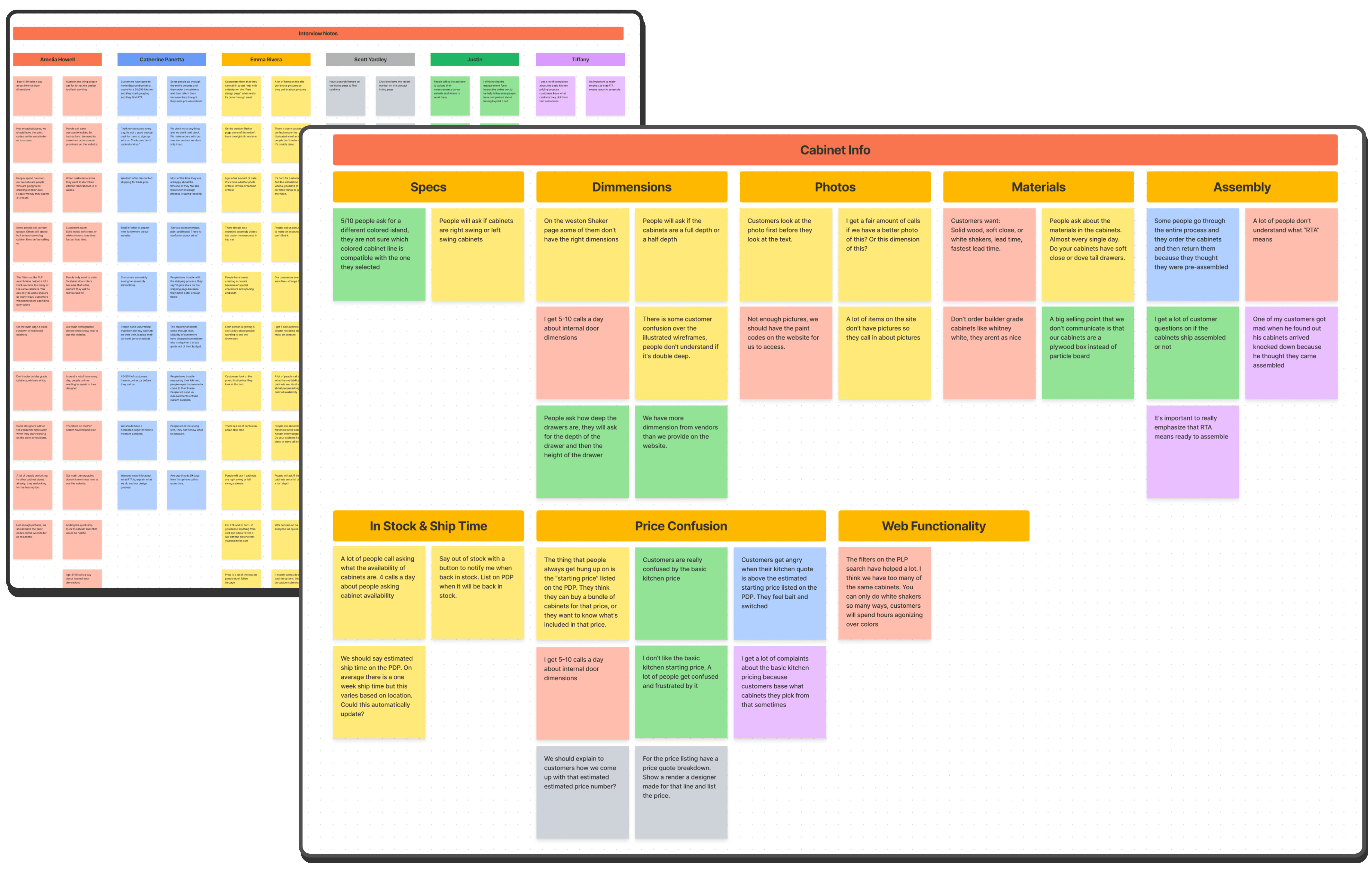
I reviewed more than 40 customer calls to understand their biggest needs and pain points. The most frequent questions that came up were about cabinet dimensions and fit and what the materials were made of.
I studied the cabinet selection experiences of our competitors to identify how they were solving for the process of facilitating this complex transaction that had many different dependencies. During this process I identified many design patterns I wanted to adopt in our own solution.
My research revealed four recurring pain points across user segments that directly contributed to volume of calls to customers support, and abandonment of the site. I knew the design had to center on resolving these tensions.
🔎
Trouble Finding Specific Cabinets
Customers were forced to manually scroll through 250+ SKUs to locate the right cabinet variant. Many resorted to using browser search (Command+F) to filter the page because no search or filter tools existed.
ℹ️
Important Product Info Hidden
Users often ask for key product information like whether a cabinet has soft close doors, dovetail drawers and what material it is made out of. Currently this information is hidden in large swaths of text and is hard to find.
📐
Need More Specific Dimension Details & Visuals
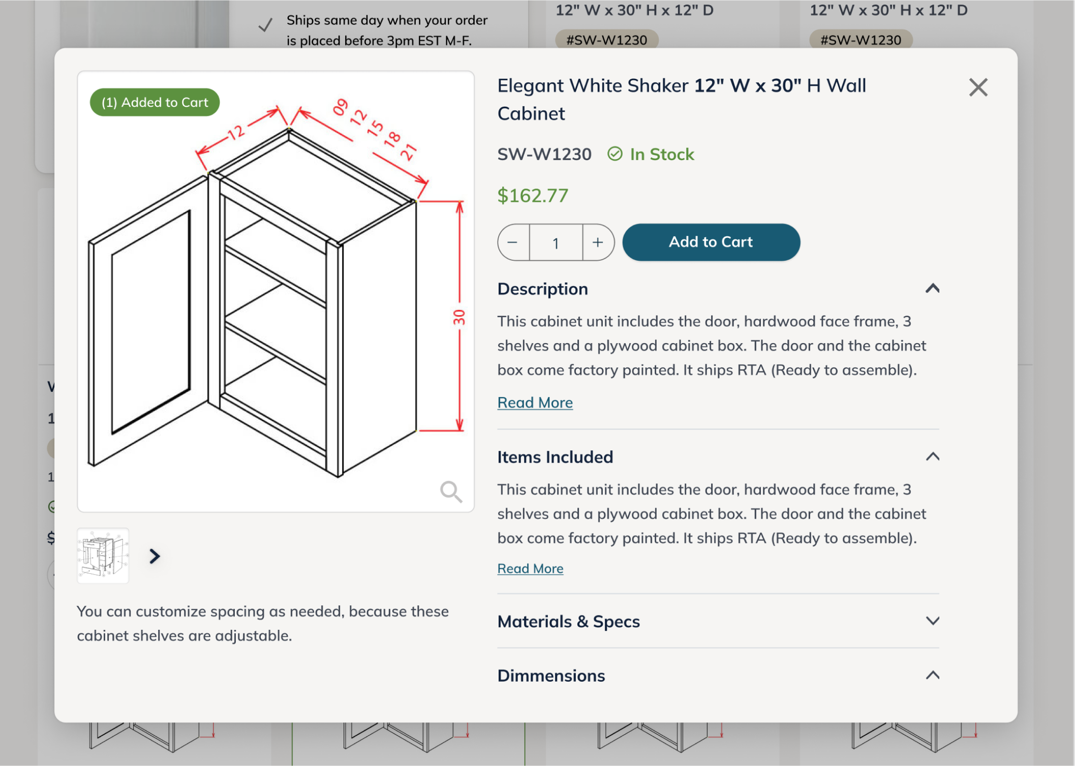
Most buyers relied on wireframe line drawings to understand cabinet dimensions like depth, height, and swing direction. These visual specs were often incomplete, inconsistent, or missing entirely from the product listings, forcing users to call support or abandon the page.
🏷
Price Confusion
Customers don’t understand the base kitchen cabinet price. They think that they can get a whole kitchen for the listed price when really it's only a 10ft x10ft kitchen estimate.
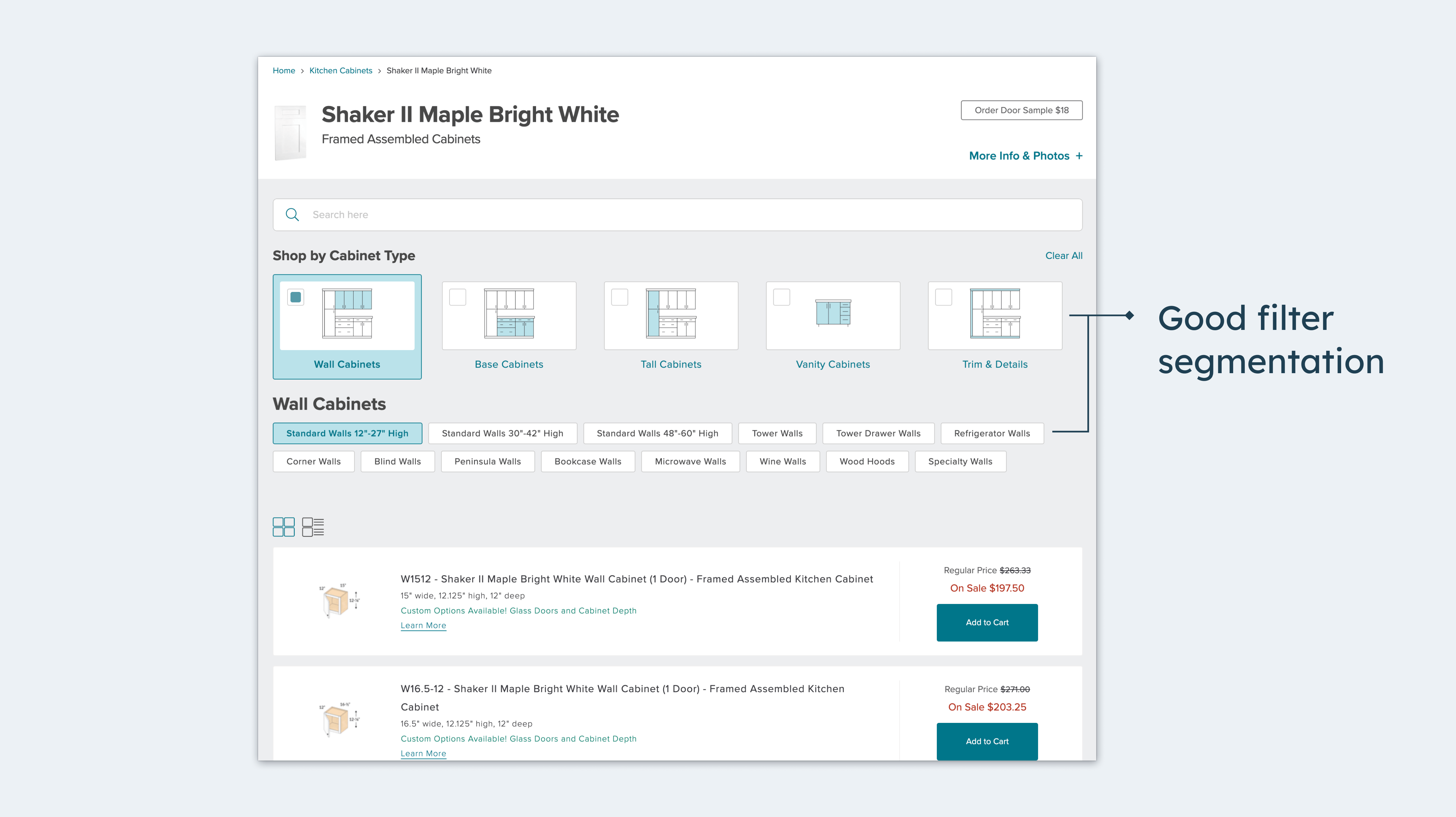
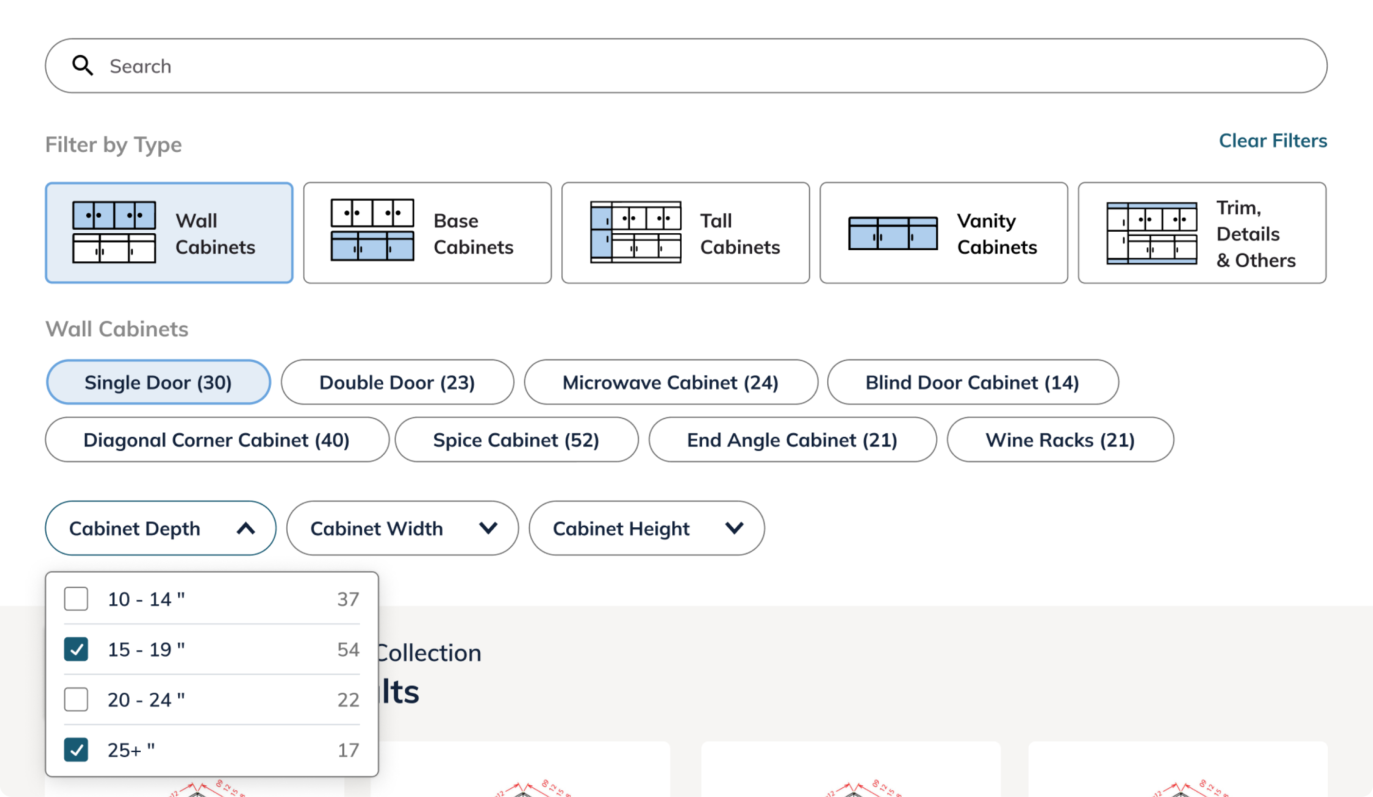
I introduced a persistent search bar and dimension based filters to help users navigate 250+ SKUs without friction. Trade buyers could now locate specific models by width, height, or cabinet type, eliminating the need for Command+F workarounds or support calls.
Many RTA customers shop visually, scanning cabinet dimension drawings before reading product names or descriptions. In the old layout, these drawings were small and deprioritized, making visual comparison difficult and frustrating. The new design elevates and enlarges the visuals, allowing users to quickly scan diagrams first and read product details second, matching how they naturally browse.
I added a new “Materials” section with icons near the top of the page to surface critical details like solid wood doors, dovetail joints, and soft-close hardware. These specs were previously buried in long descriptions, causing buyer hesitation and daily support calls.
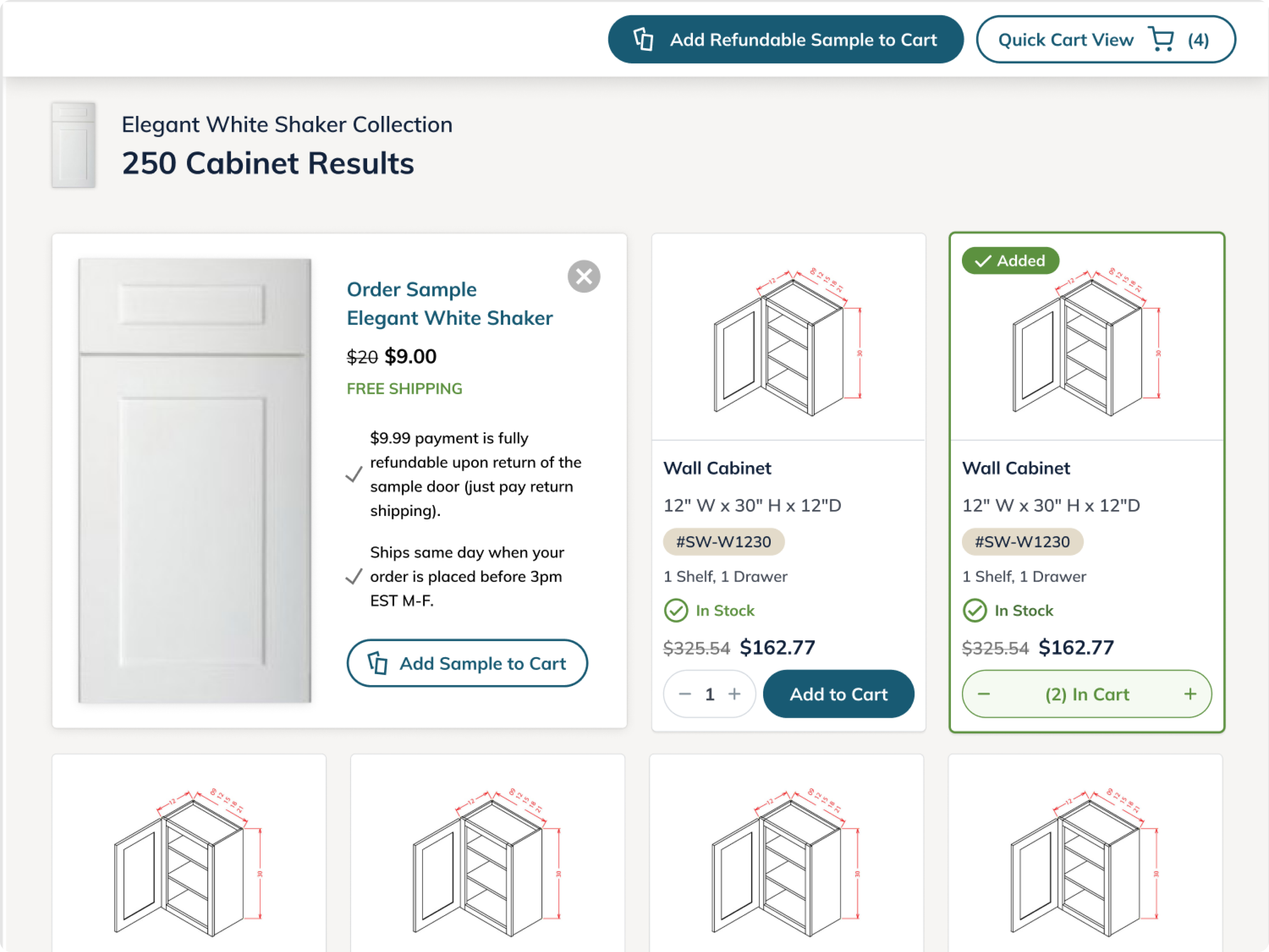
Many customers, needed specific cabinet details we already had from vendors but hadn’t provided on the site. To reduce friction and improve decision making, I introduced a new modal for each cabinet variant and partnered with the RTA sales team to populate missing specs directly into the UI.
The page displayed a prominent “Starting at” price based on a generic 10x10 kitchen layout, often misinterpreted as the actual cost for a full set of cabinets. With no explanation, this created confusion and eroded trust. I introduced a clear explanatory modal near the price to break down the estimate and set accurate expectations upfront.

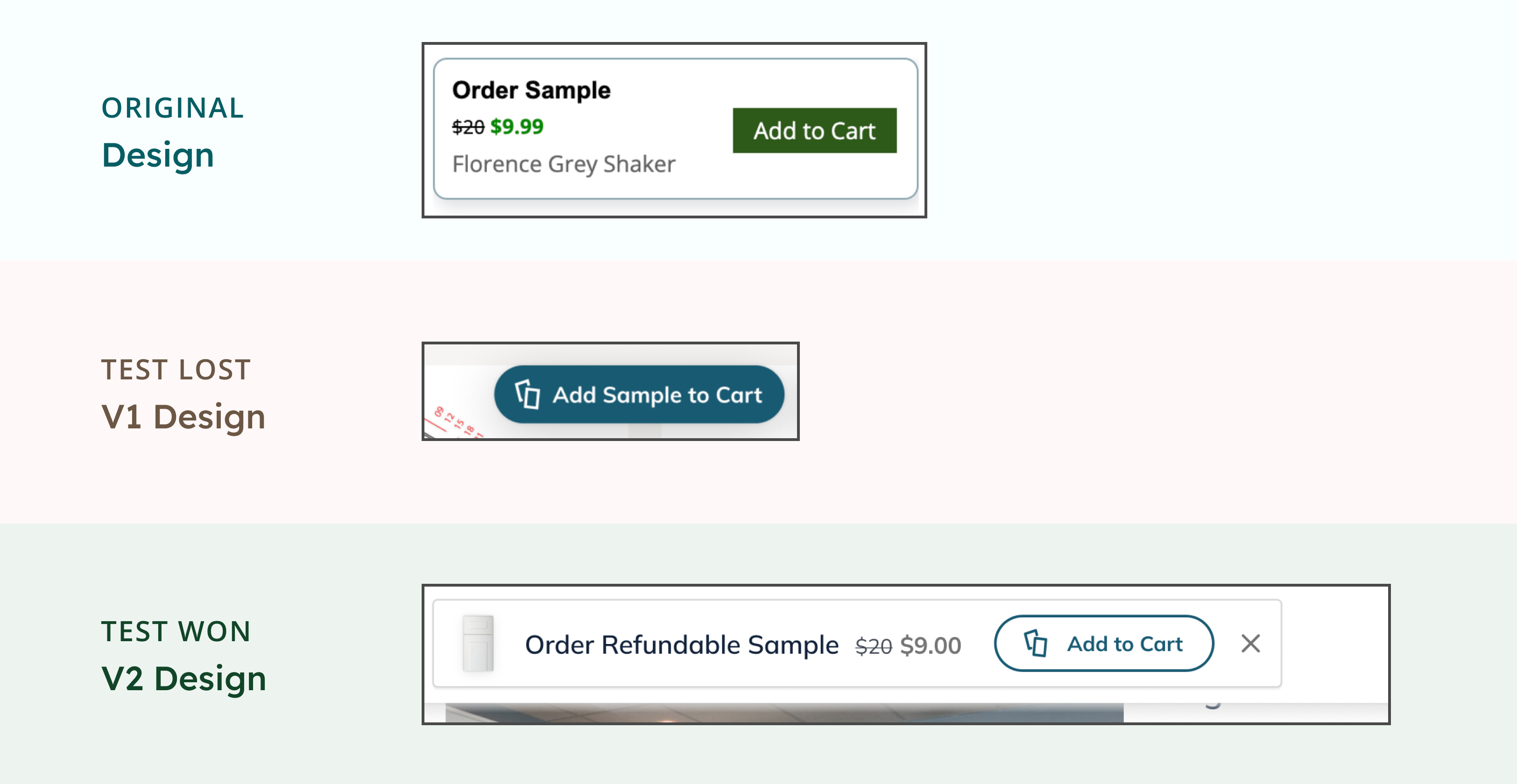
The redesigned experience was A/B tested with 50% of total traffic. After 7 days, it showed a –9.90% drop in product conversion and –11.81% drop in sample conversion. I paused the test and used GA event data to diagnose where the design was falling short.
GA analysis surfaced specific UX breakdowns hurting key KPIs. I rapidly implemented design fixes to address the friction and improve product and sample conversion performance.
A/B Test Data:
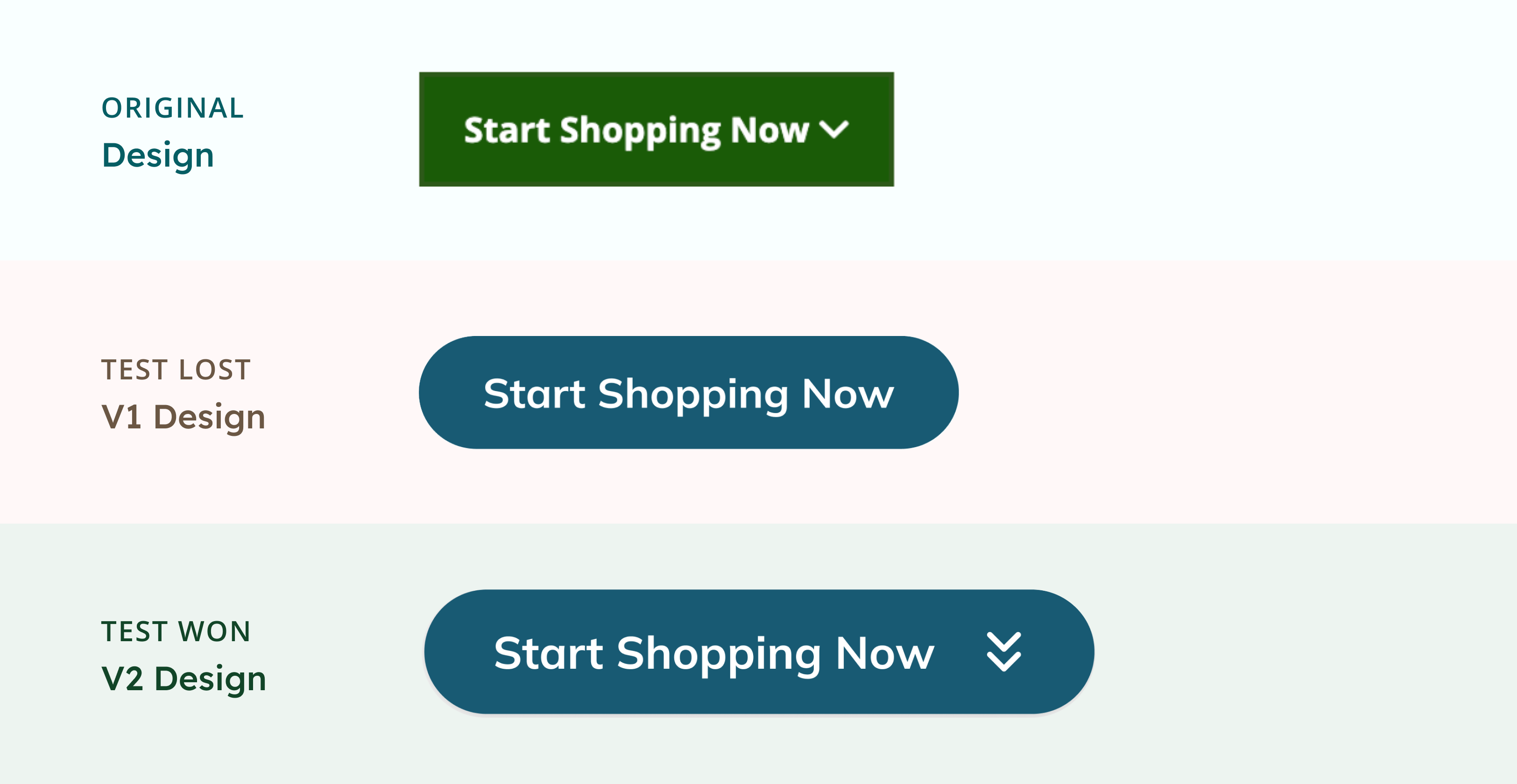
Google Analytics showed that there was a drop in clicks on the “Start Shopping Now” button on both desktop (–12.47%) and mobile (–14.55%) in new design.
Problem Hypothesis:
Changing the button color to blue and removing the downward chevron lowered its visual prominence. As a result, users were overlooking the CTA and missing the entry point to the shopping section.
Adjustment:
I reintroduced the chevron and added a subtle drop shadow to increase contrast. These updates helped restore the button’s visibility and improved click-throughs.
A/B Test Data:
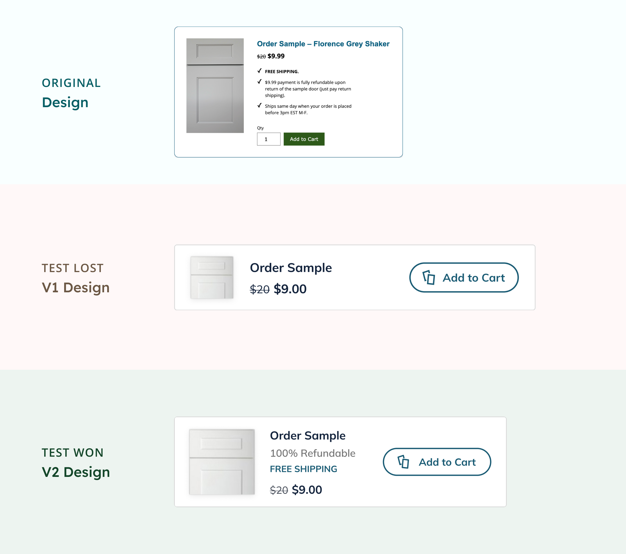
Google Analytics revealed that the number of clicks on the “Add Sample to Cart” button (located in the upper section of the page) stayed flat between the new and old design.
Problem Hypothesis:
In the new layout, I streamlined the sample tile too aggressively, removing persuasive messaging like “Free Shipping” and “100% Refundable.” Without this value context, the upsell lacked urgency and appeal.
Adjustment:
I reintroduced key value proposition messaging back into the order sample upsell tile, but made it more concise. The new copy says: “100% Refundable” and “Free Shipping” in the text description.
A/B Test Data:
Clicks on the lower “Add Sample to Cart” button declined by 7.44% in the new design.
Problem Hypothesis:
The updated CTA shared the same blue styling as other primary buttons, causing it to visually blend into the interface and lose prominence, especially in a scroll-heavy layout.
Adjustment:
To maintain visibility and drive engagement, I introduced a persistent, sticky CTA featuring the clearly styled "Add Sample to Cart" button. This mobile-first solution ensured the critical CTA remained visible regardless of scroll position.
Twelve days after launching the refined design, all core metrics outperformed the original experience:
Increase in product conversion rate: + 17.53%
Increase in sample conversion rate: + 43.37%
Decrease in product page exit rate: – 46.28%
The uplift in both sample engagement and completed orders validated the new design’s impact. Based on these results, stakeholders approved a full rollout to 100% of site traffic.
Questioning The Status Quo
The RTA Cabinet Store was our top revenue driver and had the highest conversion rates in the portfolio, so its user experience was seen as “good enough.” But when I reviewed analytics and listened to customer calls, it became clear that the outdated UI was quietly blocking sales. Questioning what looked successful on the surface revealed one of our biggest growth opportunities.
Building RTA’s First Figma Design System
What began as a redesign of one page became the foundation for RTA’s first Figma design system. Following the team’s transition from Adobe XD, I created our initial shared library and usage guidelines to make every component reusable and consistent. Establishing this system reduced design debt, improved cross-team efficiency, and set a scalable model for how we build going forward.
Anticipating Failure to Design for Recovery
One of the most valuable habits I adopted from this project was proactively forming "failure hypotheses" during the design phase. By imagining how a design might fail and mapping that to what data would help diagnose it, I ensured the right GA tags were in place. That preparation enabled fast recovery when the first test underperformed.
Next Steps:
Unlocking Complex Configuration
Our customers often combine cabinet colors from different vendor lines, like pairing a blue island with white uppers, but our system currently treats each vendor as a silo. The next unlock is building a mix-and-match configuration tool with a shared data framework to support cross-vendor compatibility. Solving this will remove a long-standing barrier for creative customers and open a major new design workflow.

