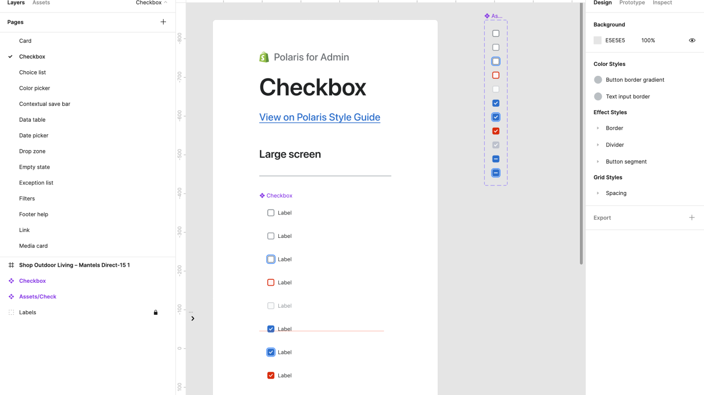
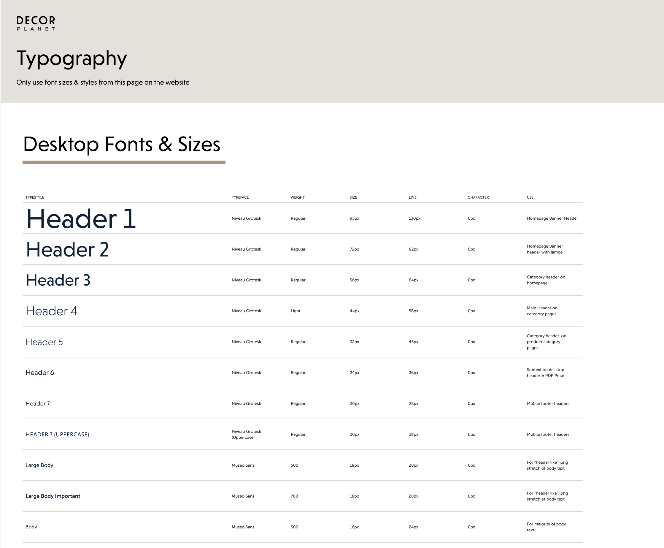
Before starting to wireframe the website’s layout in Figma, I first created a rough set of saved, default fonts and sizes in Figma. I based the sizes off the Polaris design system type scale, and later adjusted and removed sizes during my wireframing process. I started with this step to try to speed up the high fidelity wireframing process and limit myself to a number of saved sizes.

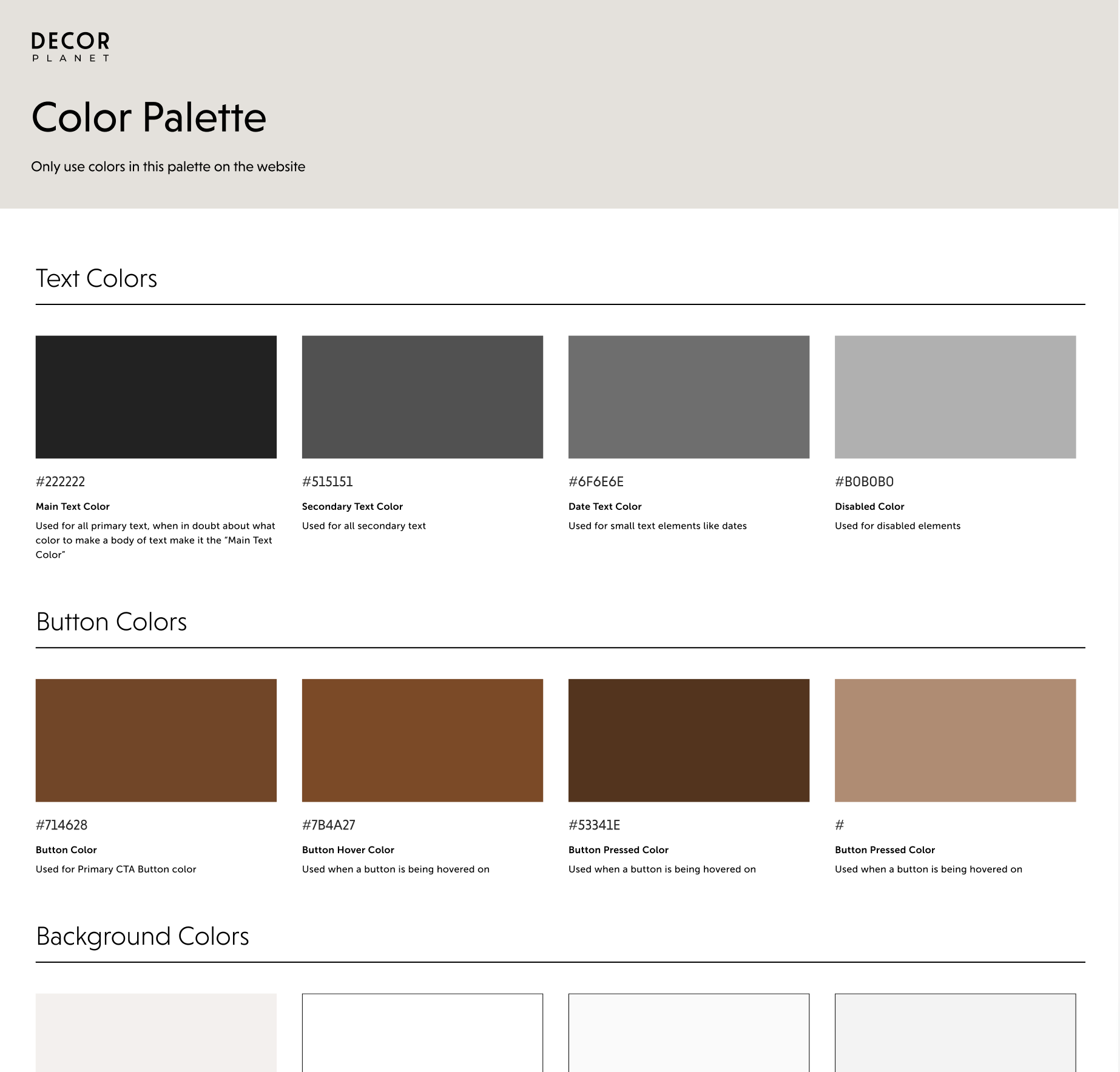
I collaborated with our graphic design team to ensure the color palette for Decor Planet's new branding matched the style on the website and the new design system.

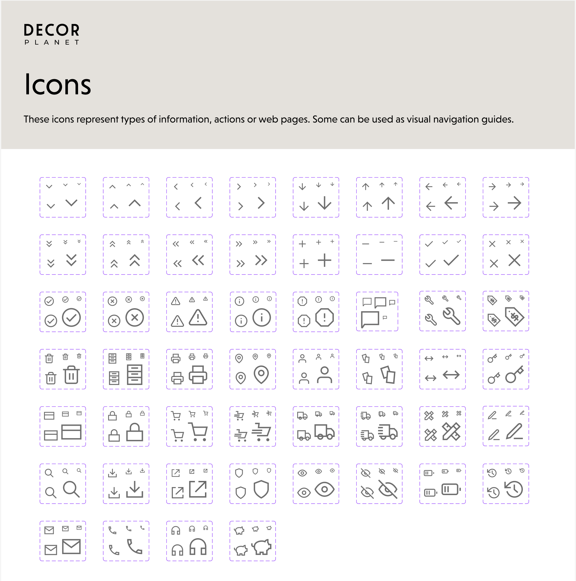
I reused a lot of icons from the previous design system for RTA that I had built, but I added some and changed the style from rounded to more edgy.
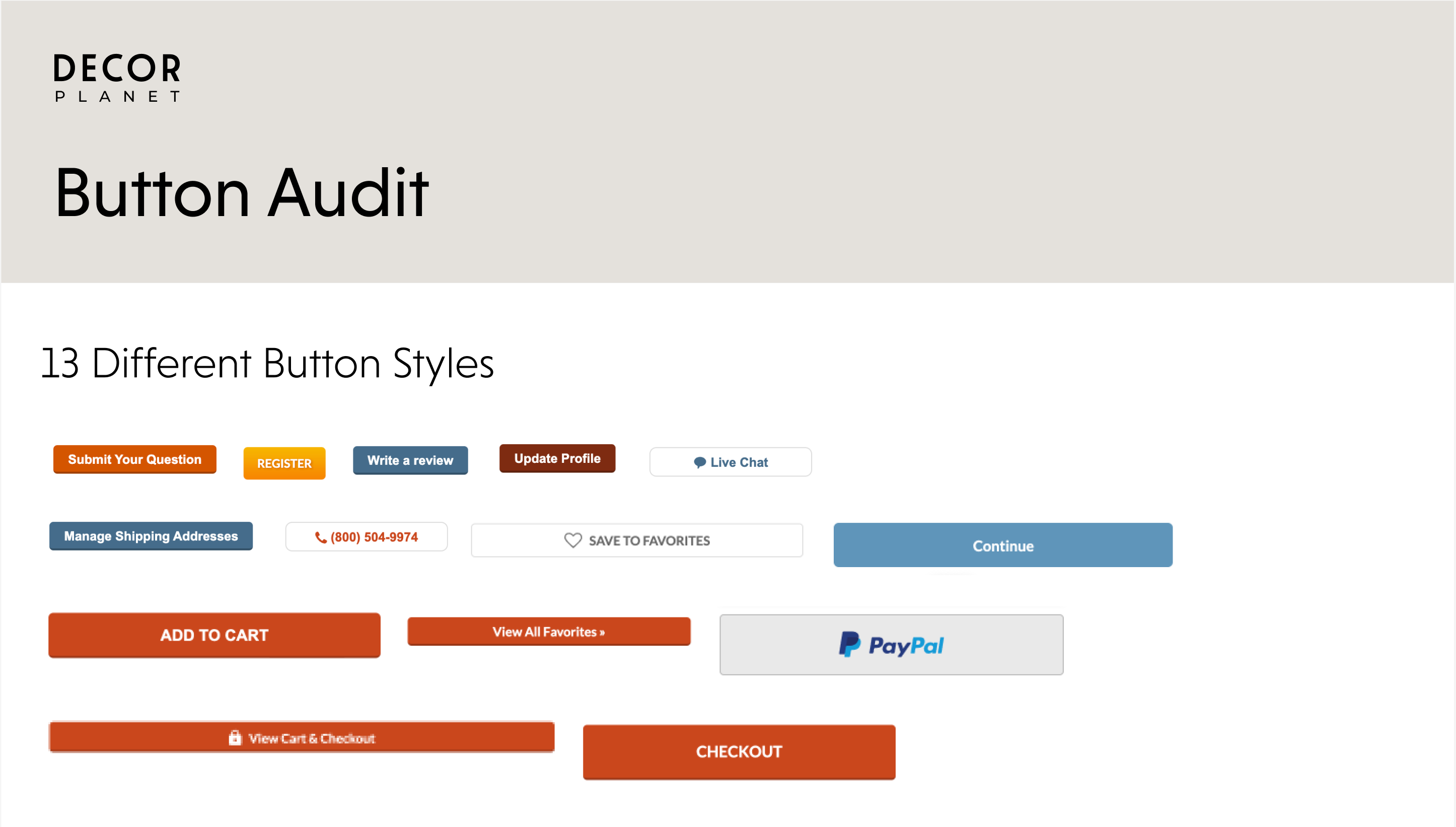
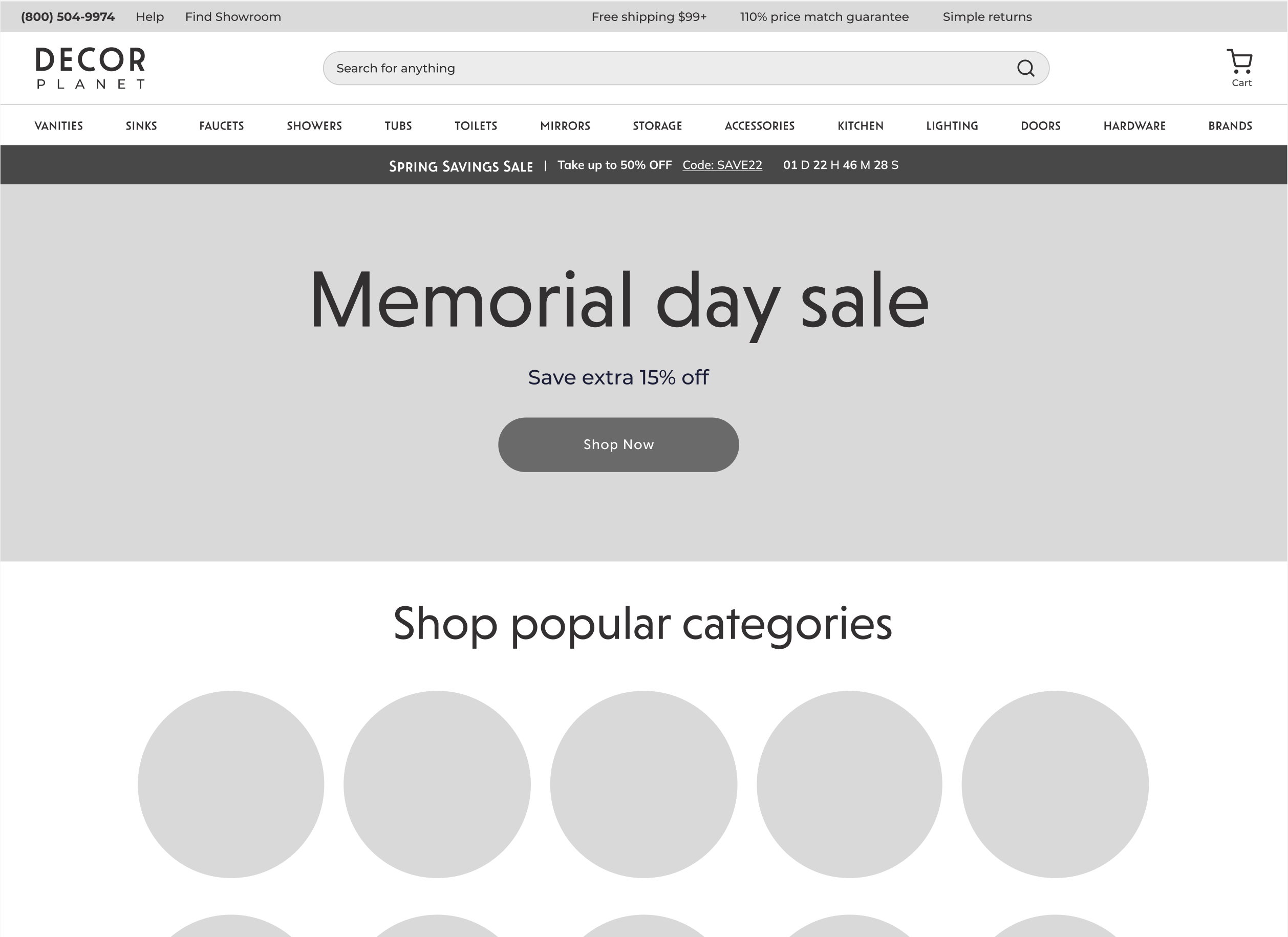
I created a new rounded button style for the website in collaboration, again, with our graphic design team to ensure it was up to brand standards.

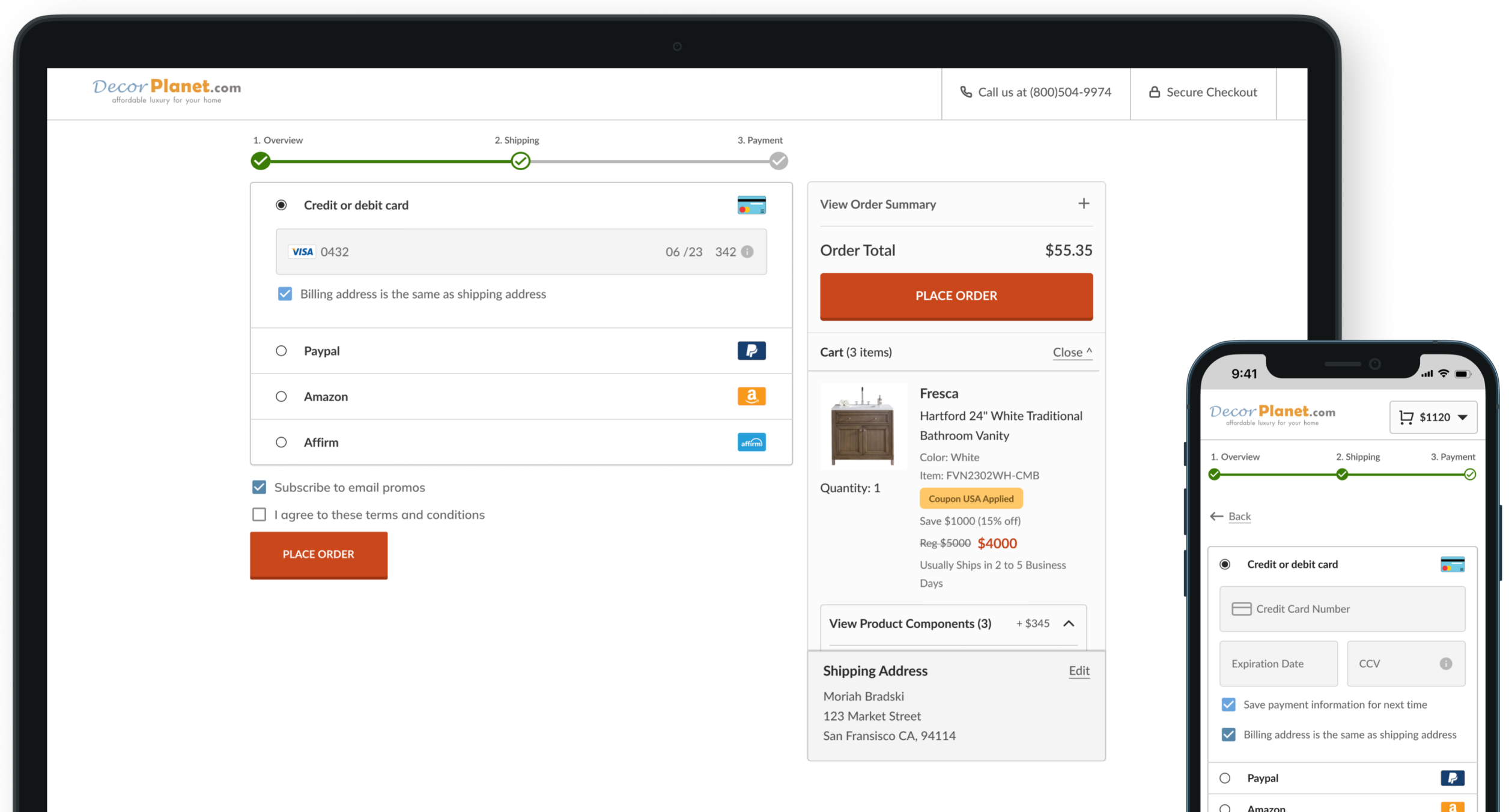
The next step I took was to update existing components that I had previously created for the old design system. Since the timeline and development capacity for this project was restricted, the goal was to just update as many current components as possible with different color and fonts.

Most of the components currently used on Decor Planet's website did not exist in Figma because they were created so long ago and never altered much. One of the most time-consuming parts of this project was creating and structuring a lot of the website components that were going to be used for the first time.
